Branding Setup
In this section, you will learn how to personalise your store’s look. From updating logos and adjusting colors to adding the links of your social media pages in the Header and Footer, these tools help you create a consistent, professional, and branded experience for your customers.
Accessing Branding Setup
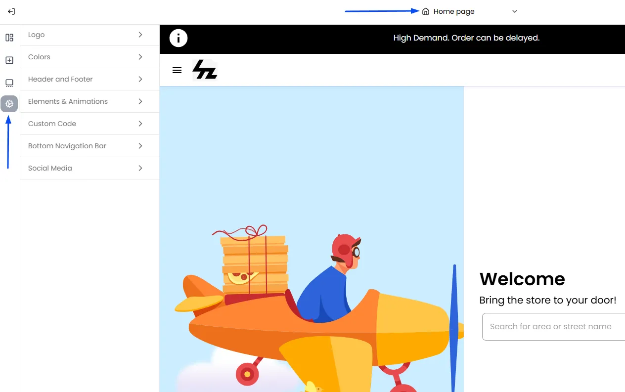
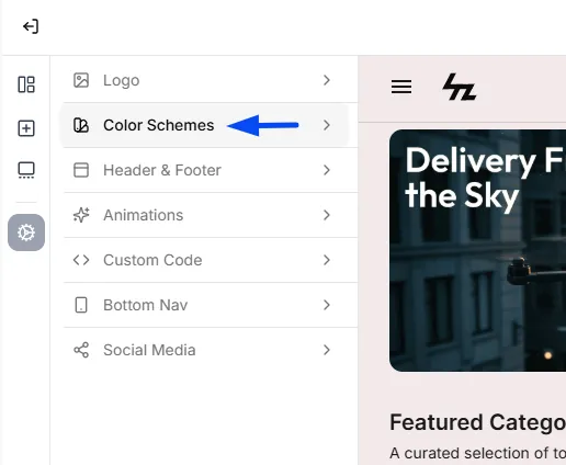
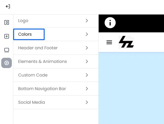
To access the Branding settings, go to Admin Panel > Theme Builder. Then, click the Settings icon in the left panel to access the available options for customizing and personalizing your store’s appearance.
Logo: Setting Your Brand's Identity
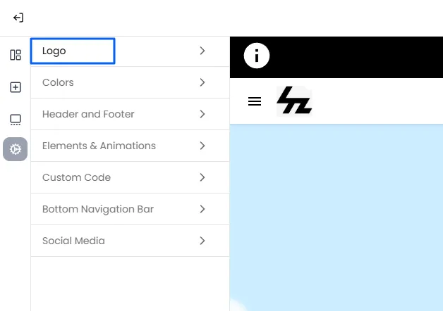
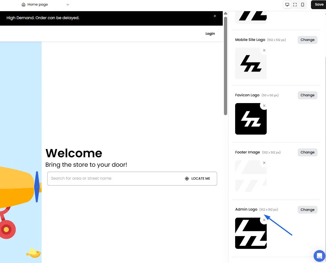
From the Logo section, you can easily change your site logo, admin logo, and favicon to align with your brand's identity.
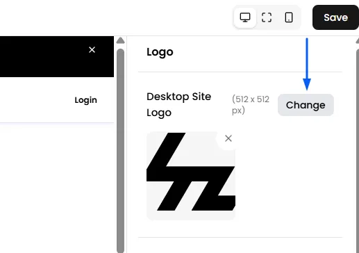
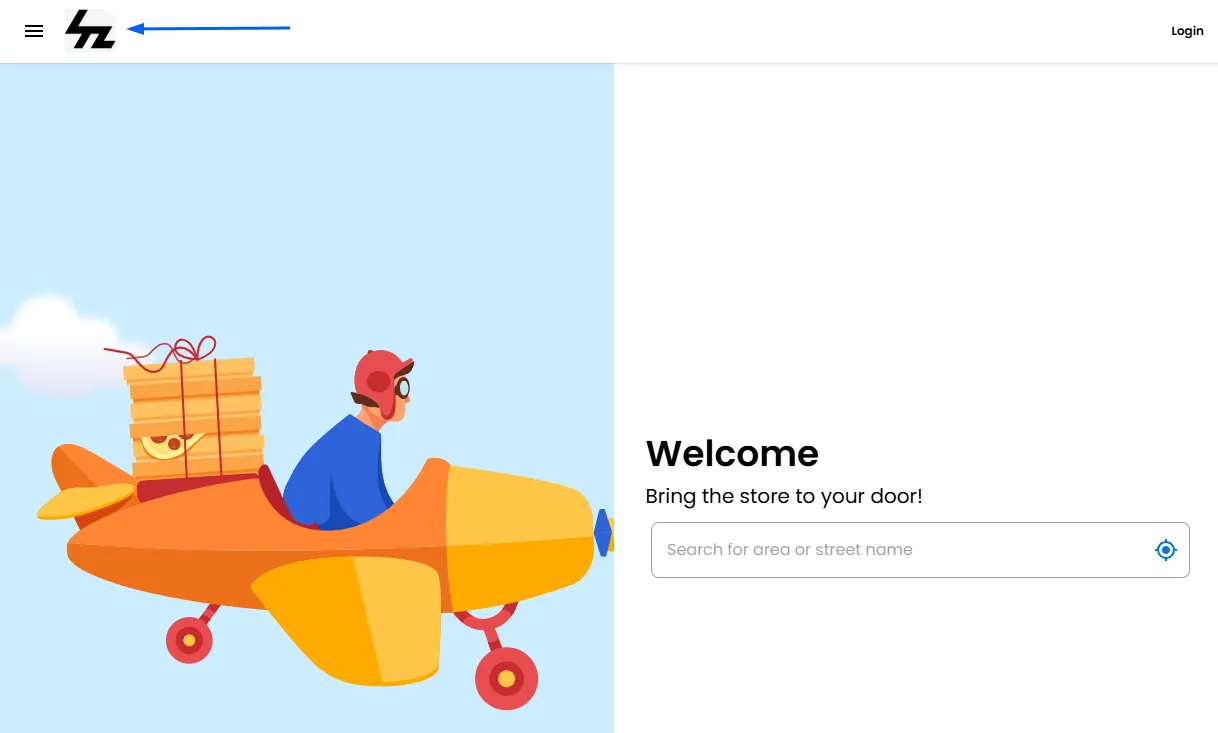
Desktop Site Logo
You can upload your business logo for branding.
Recommended size: 512x512 pixels
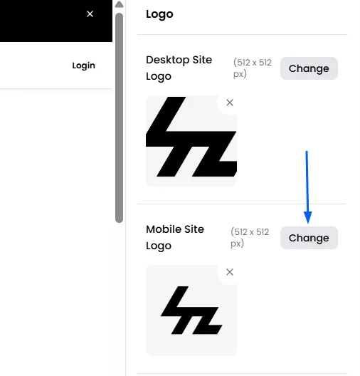
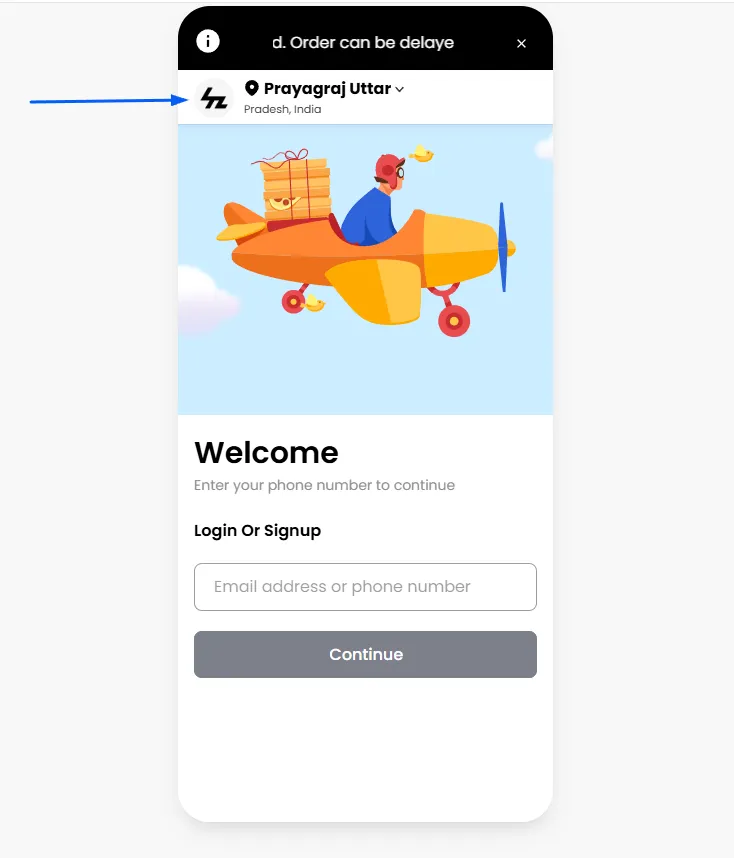
Mobile Site Logo
This is the logo that appears in the header when your site is viewed on a mobile device screen.
Recommended size: 512x512 pixels
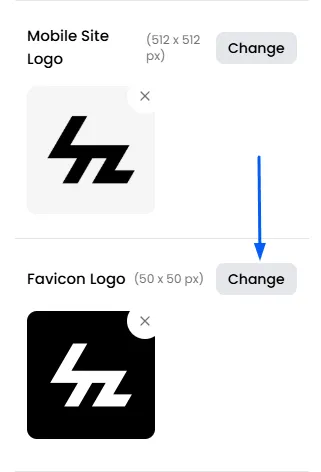
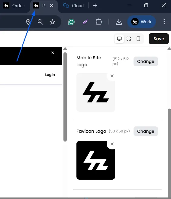
Favicon Logo
It is the small icon displayed in the browser tab when users visit your store.
Recommended size: 50x50 pixels
Footer Image
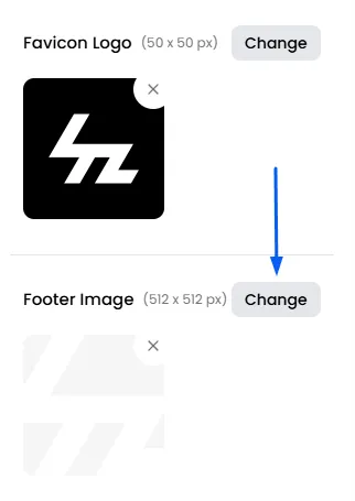
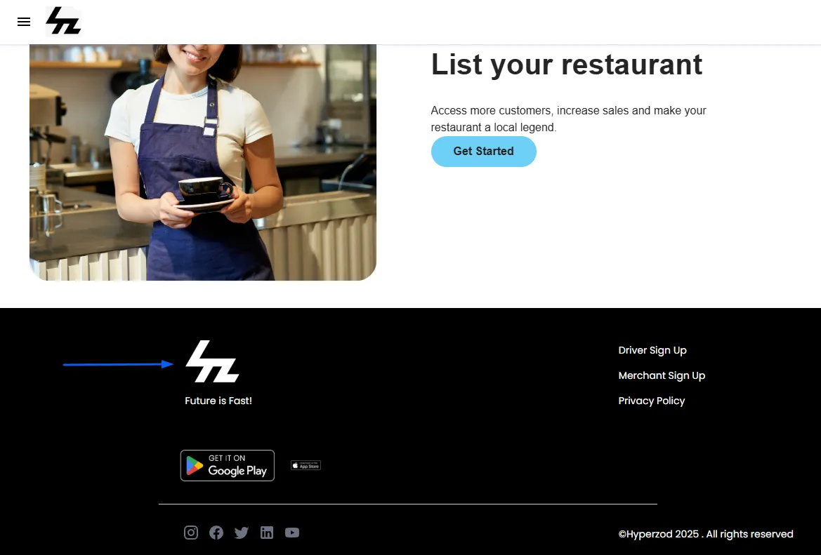
This is the logo that will be displayed in the footer (the section at the very bottom of every page).
Recommended size: 512x512 pixels
Admin Logo
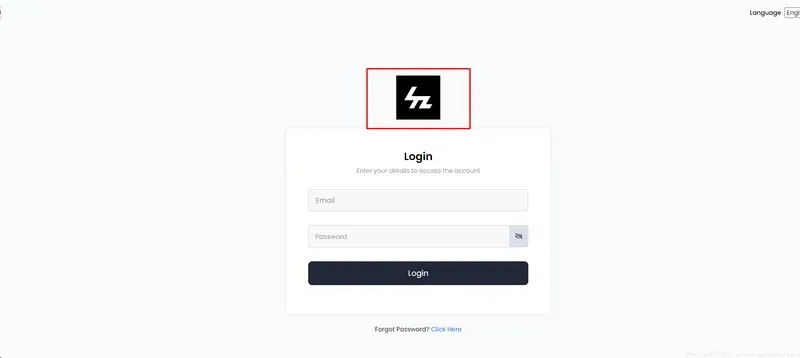
Your admin logo will now display on the login screen for invited users or merchants.
Recommended size: 512x512 pixels
Color Schemes
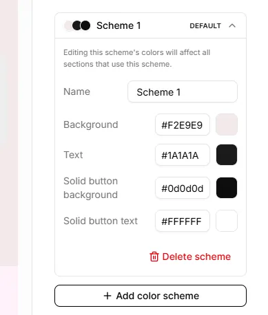
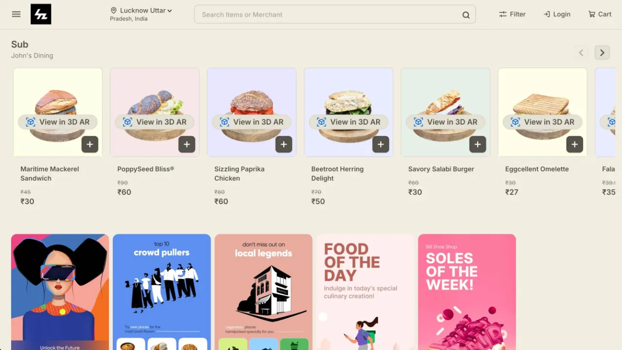
Customize the look and feel of your website and apps by creating and applying Color Schemes. You can define colors for different elements, such as the background, text, buttons, and other interface elements, allowing you to create a consistent look that matches your brand.
Create Multiple Color Schemes
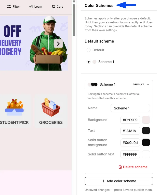
You can create multiple color schemes and use them for different sections of your website. This allows you to experiment with different color combinations while keeping each scheme separately configurable.
Note: Colour schemes apply only after you choose a default one. Until then, your storefront looks exactly as it does today. Sections can override the default scheme from their own settings
Note: Once you have selected a Color Scheme, you can go to different sections, such as the Header, Footer, and others, and apply the selected color scheme accordingly.
Customize Your Website Appearance
Within a color scheme, you can customize options such as:
- Background: Sets the background color used across applicable sections.
- Text: Defines the color of text displayed within the scheme.
- Solid Button Background: Sets the background color for solid buttons.
- Solid Button Text: Sets the text color displayed on solid buttons.
This gives you greater control over your website's overall appearance and makes it easy to create a design that aligns with your brand.
Colors
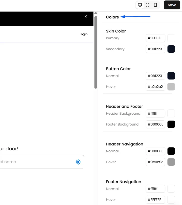
Customize the overall look and feel of your storefront by configuring colors for the theme, buttons, header, footer, and navigation menus. These settings help you match your storefront's appearance with your brand identity.
For more advanced color changes, custom CSS styling can be applied to all existing elements.
Header and Footer
The Header and the Footer are two of the most important parts of your website. You can utilize it for important announcements and key business information.
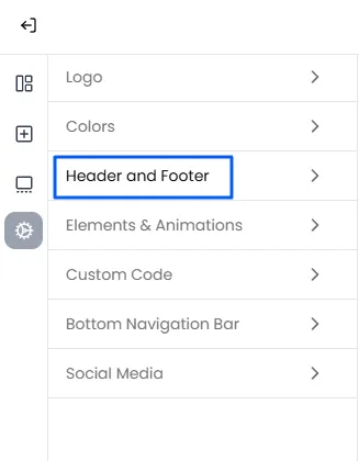
Custom Header Notice
This feature enables you to showcase important messages at the top of your website or ordering apps, ensuring customers are informed about key updates. For example, you can use this section to communicate a message such as "Orders placed after 10:00 pm will be delivered the following day."
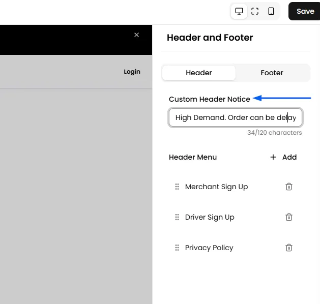
Header Menu
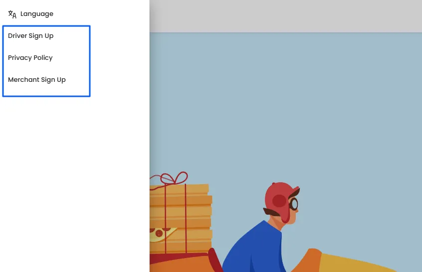
In this section, incorporate essential buttons to enhance user navigation. For example, include buttons for custom forms like Merchant/ Driver Signup, Merchant Panel Login button through their links, and other custom pages created through Page Settings, such as About Us and Contact Us.
You can add links to your custom pages, such as Terms of Use, Privacy Policy, Contact Us, etc in the header and footer of your website and mobile apps by following the steps demonstrated below.
- Click on "Add" to create a new button for the Header Menu Sidebar.
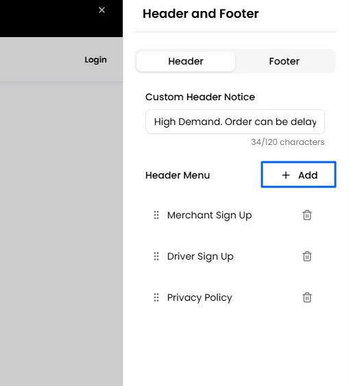
- Enter the name for the button, which will be visible to customers in the Header Menu.
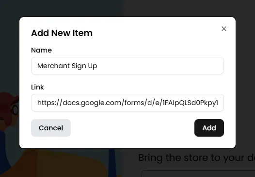
- Provide the link for the button, specifying the destination to which customers will be redirected upon clicking.
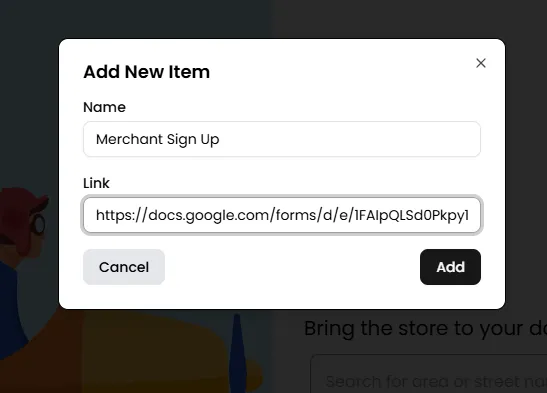
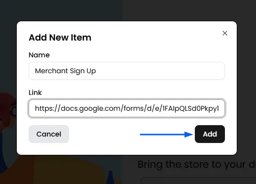
- Finally, click "Add" to include the button. Similarly, you can add more buttons in your Header Menu Sidebar.
Copyright Text
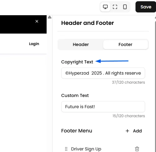
Add a custom copyright message, such as "Powered by [Your Company Name]," to display in the footer of your website.
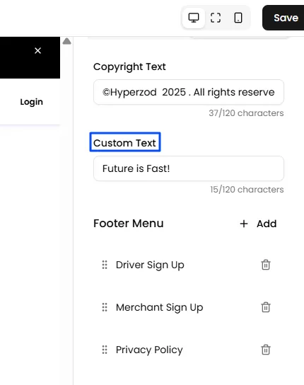
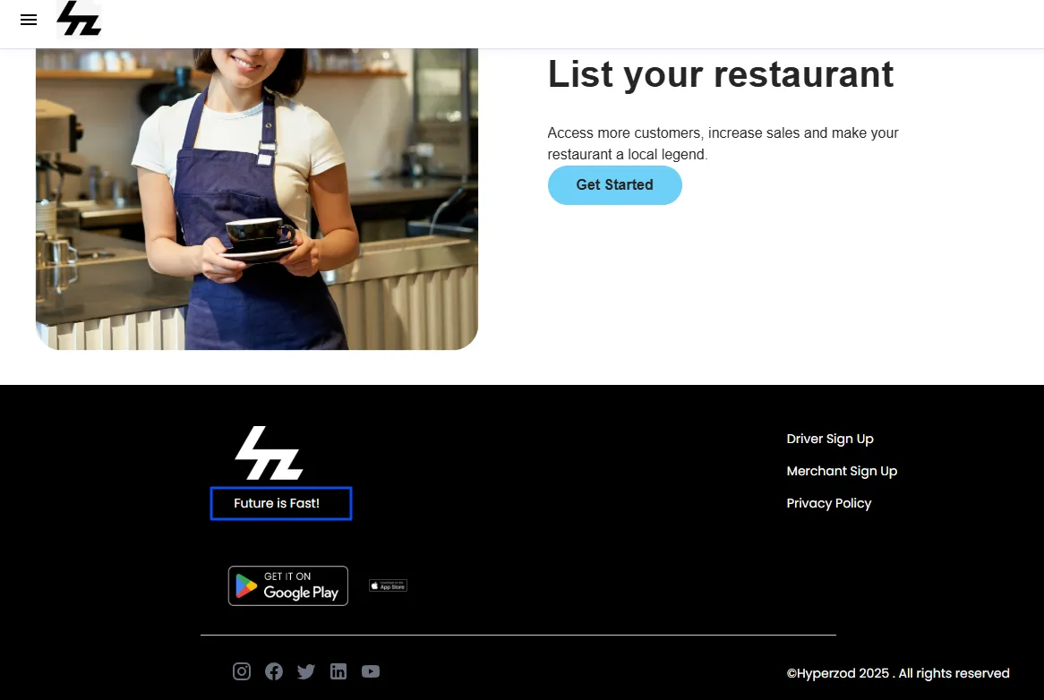
Footer Custom Text
Input your business address or any other custom text to include it on the website's footer.
Footer Menu
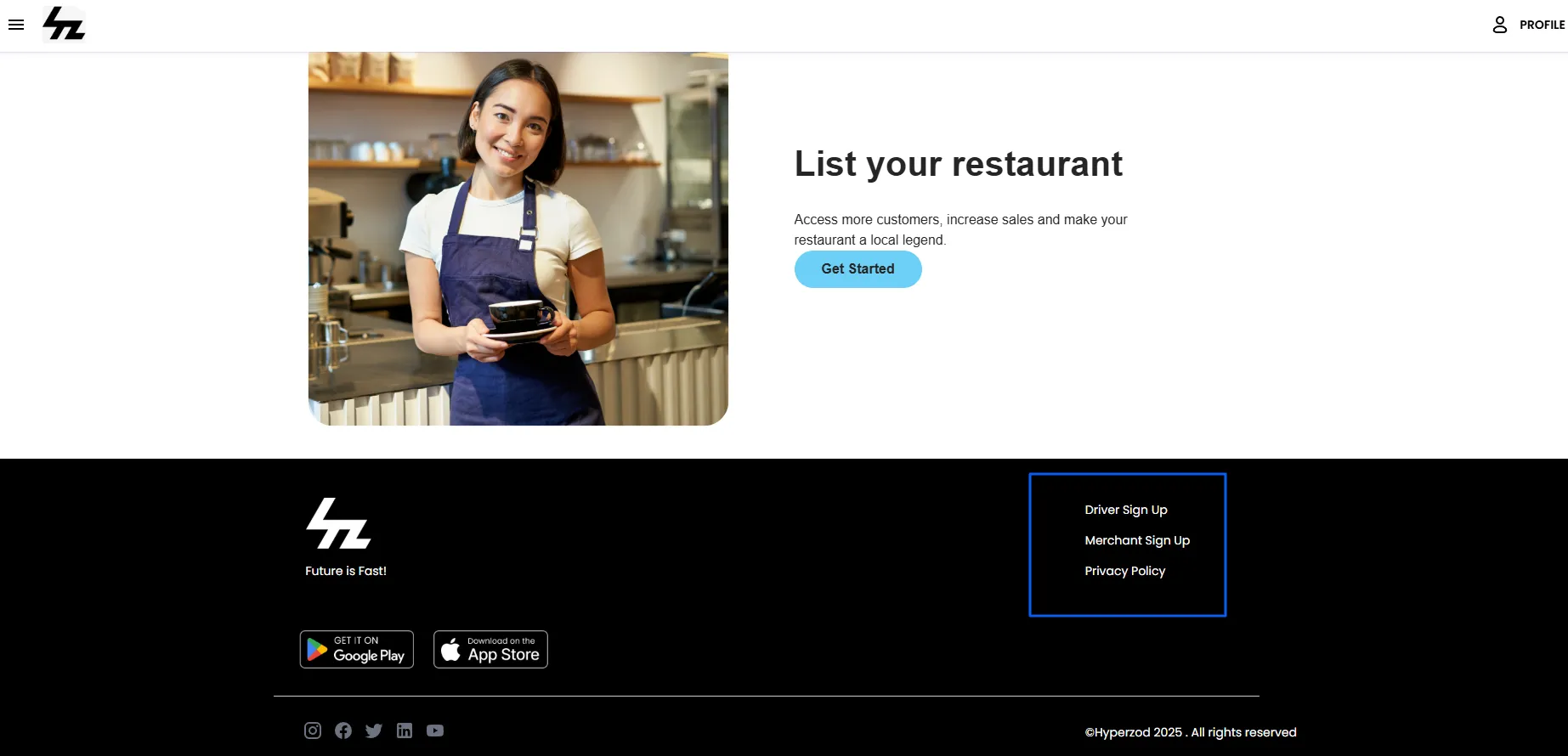
In the Footer, add important links for easy navigation. For example, include links for Store Signup, Merchant Panel Login, and additional pages generated through Page Settings, such as About Us, Contact Us, or Privacy Policy, in the website's footer.
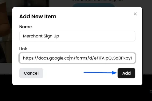
- Click on "Add" to create a new button for the Footer Menu.
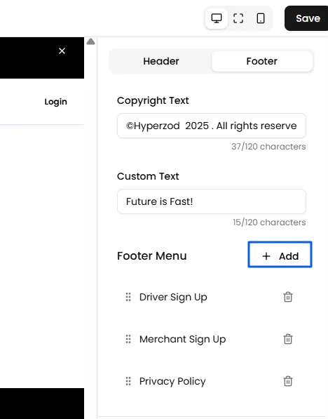
- Enter the name for the button, which will be visible to customers in the Footer Menu.
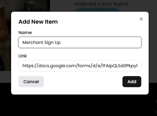
- Provide the link for the button, specifying the destination to which customers will be redirected upon clicking.
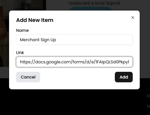
- Finally, click "Add" to include the button. Similarly, you can add more buttons to your Footer Menu.
Note: To customize the footer, target the appropriate CSS selector and apply your desired styling using the Custom Code section.
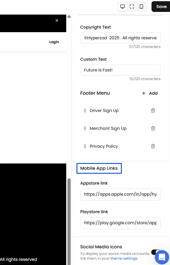
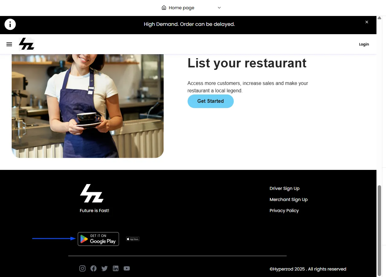
Adding Mobile App Links
This is where you connect the "Download on the App Store" and "Get it on Google Play" buttons in your footer to your actual apps.
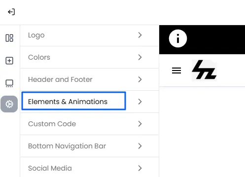
Elements & Animations
The "Elements & Animations" section is where you can fine-tune the small visual details that make your website feel more dynamic, modern, and delightful for your customers.
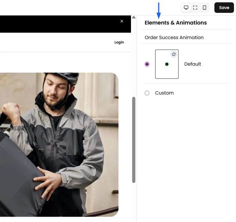
Order Success Animation
Customize or use the default splash animation that appears after orders are placed on the ordering apps.
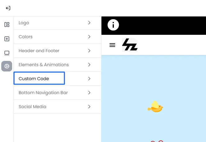
Custom Code: For Advanced Customization
The Custom Code feature enables you to enhance your store's functionality and appearance by adding custom HTML, CSS, and scripts like Live Chat or Google Analytics. You can customize specific elements on your website and app, applying changes globally, to web pages, or app screens. This feature is especially useful for advanced customizations beyond the sections available in the Builder, such as styling the checkout page, the add-to-cart page, or injecting custom scripts into the footer.
Global
Code placed in the Global section will be applied everywhere, on your website, your mobile apps, and across all pages.
- HTML Head: Add custom meta tags, tracking codes, or other HTML content to the head of your website.
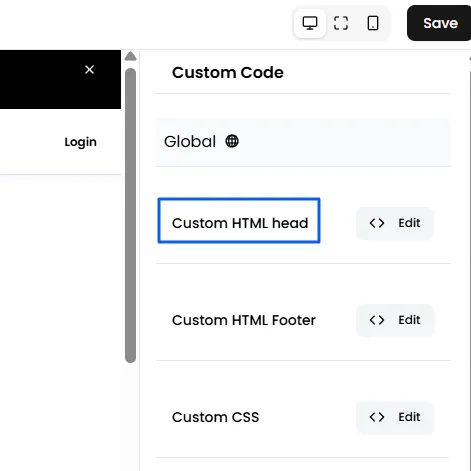
- HTML Footer: Inject custom HTML code into the footer section of your website, such as Live Chat, social media links, or scripts.
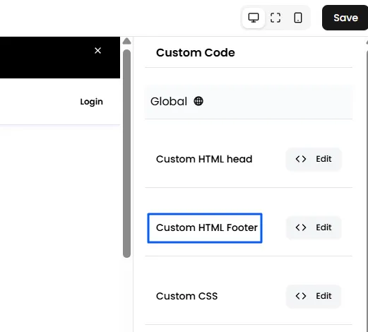
- CSS: Apply global styles using custom CSS, affecting all pages and app screens.
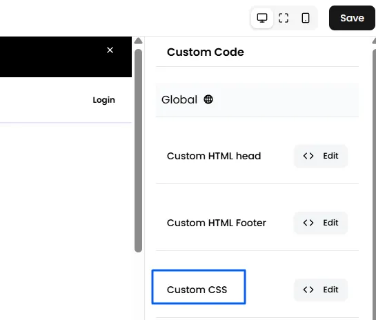
Web
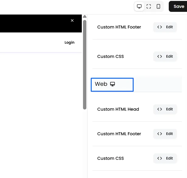
In the Web section, you can customize elements specifically for the website.
- HTML Head: Add custom HTML content for your website’s head, including additional scripts or styles.
- HTML Footer: Inject custom HTML code into the footer of your website, such as analytics or third-party tools.
- CSS: Apply custom CSS to style the website elements according to your preferences.
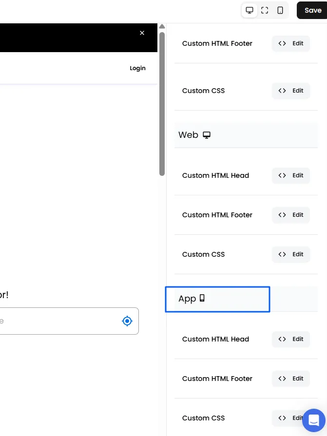
App
The Apps section allows you to add custom code specifically for the app.
- HTML Head: Add custom HTML code to the head of your app to implement tracking or app-specific features.
- HTML Footer: Customize the footer of your app with HTML code, such as adding app-specific content or scripts.
- CSS: Use custom CSS to adjust the appearance of your app, including styling app-specific elements.
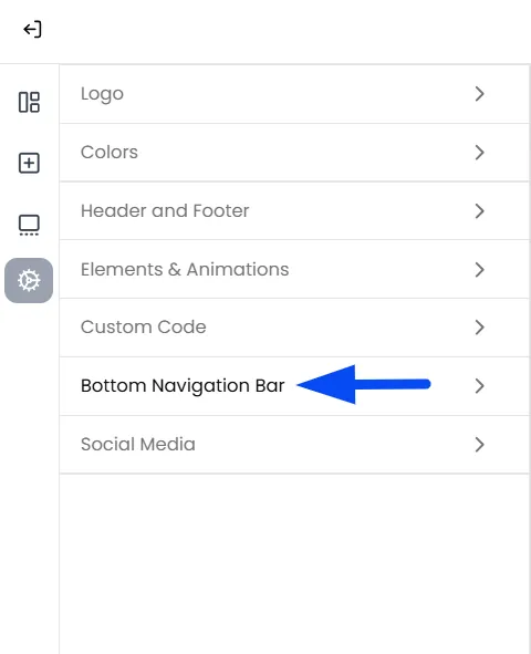
Bottom Navigation Bar
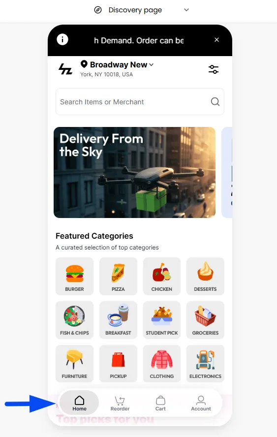
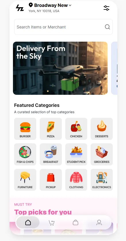
The Bottom Navigation Bar is a key part of your store’s experience. It contains essential buttons like Home, Reorder, Cart, and Account, giving users quick access to vital features.
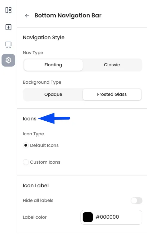
Choose a Floating style and Frosted Glass background for a modern, high-end feel, or keep it Classic and solid. By customizing the icons and labels, you create a seamless and exciting browsing experience.
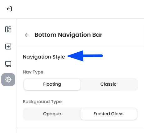
Navigation Style (The Overall Look)
This section determines how the menu bar is positioned on the screen.
Navigation Types
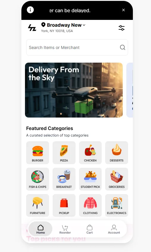
- Floating: This creates a detached navigation bar that sits slightly above the bottom edge of the screen with rounded edges, providing a spacious and contemporary feel.
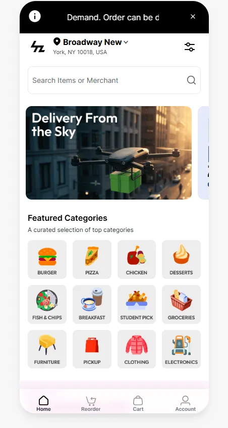
- Classic: This creates a full-width navigation bar docked at the bottom of the screen, providing a solid, grounded appearance.
Background Types
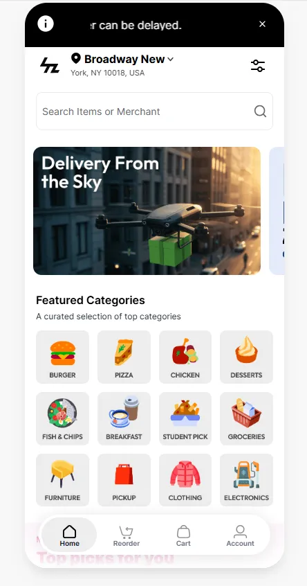
- Opaque: This applies a solid, non-transparent background color to the bar, ensuring high contrast and consistent visibility for all navigation icons.
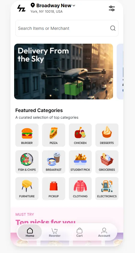
- Frosted Glass: This applies a semi-transparent, blurred effect that allows the colors of the underlying content to show through while maintaining text readability
Customize Icons
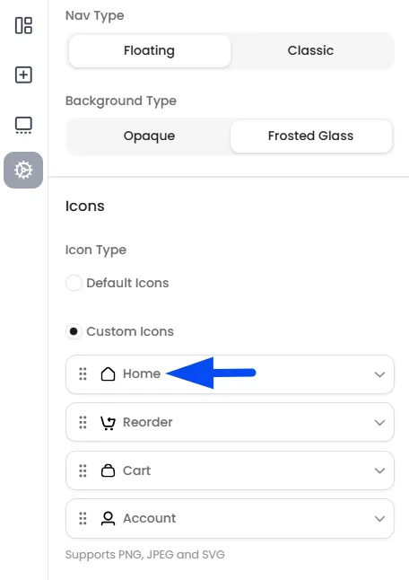
Decide whether to use the Default Icons for buttons such as Home, Reorder, Cart, and Account, or upload your Custom Icons to personalize the navigation bar.
- Click on each button to start customizing.
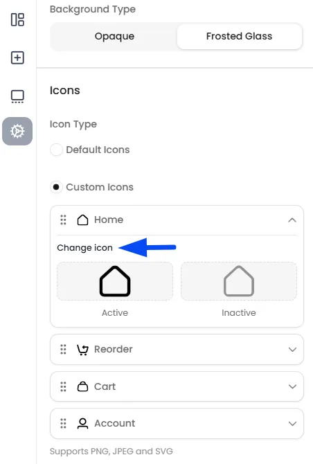
- Upload Active State Icon: Select an icon to represent the button when it is active.
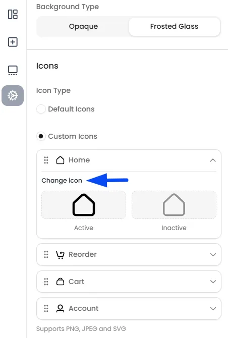
- Upload Inactive State Icon: Choose an icon to represent the button in its inactive state.
Icon Label
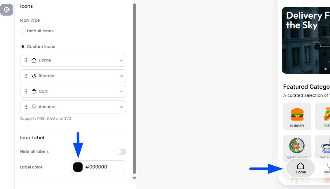
Icon Labels add clear text descriptions under each icon. Use the Hide all labels toggle to create an icon-only look, and adjust the Label color to ensure the text remains sharp and easy to read against your background.
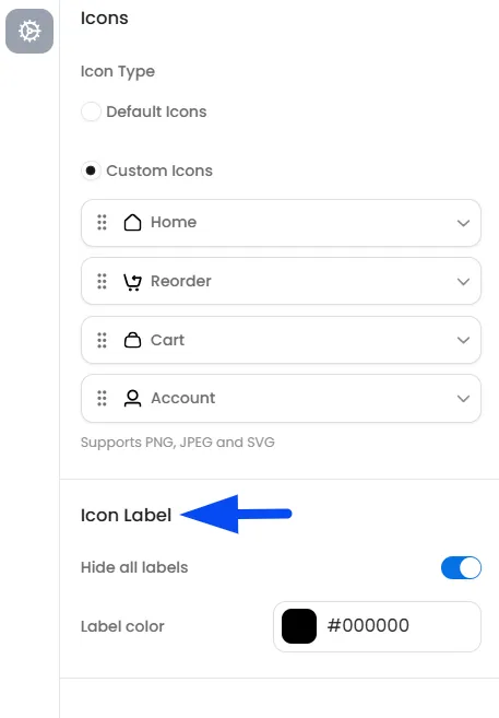
Hide All Labels
This toggle controls the visibility of the text beneath your icons. When switched on, the text descriptions are removed.
Label Color
This allows you to set a specific color for the navigation text.
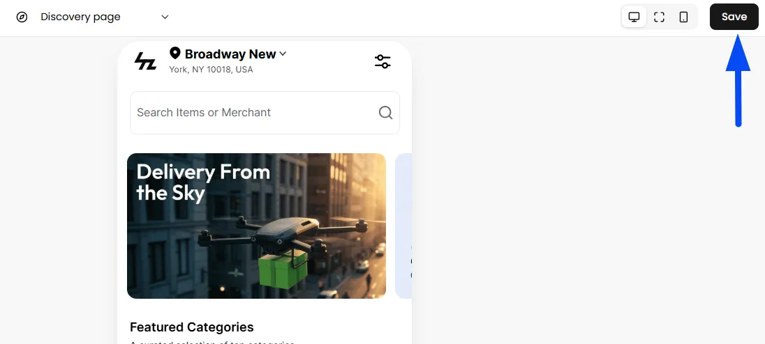
Once you’ve made all your customizations, click Save to apply them.
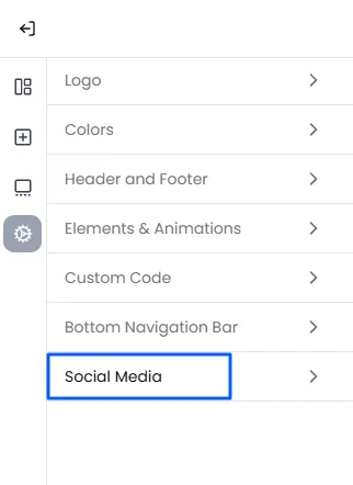
Add Social Media Links
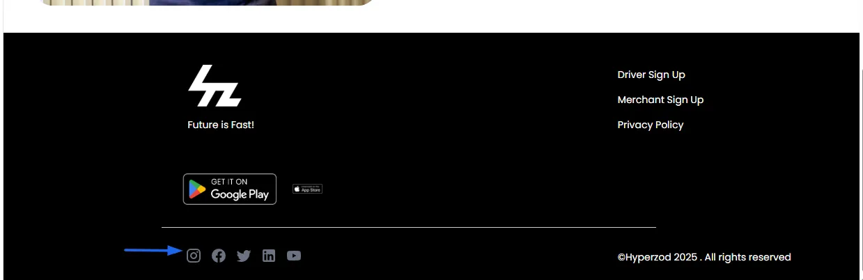
Use the Social Media section in the theme editor to add clickable icons that link directly to your social media pages. This makes it easy for customers to follow you, stay updated, and engage with your brand.
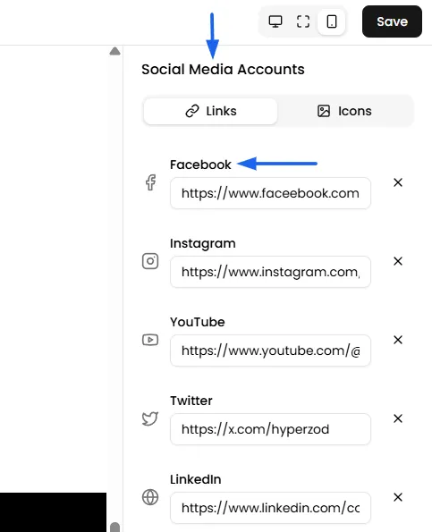
- Add Links: This is where you will provide the actual web addresses (URLs) for each of your social media pages. Copy the full URL of your social media page (e.g., Facebook, Instagram) and paste it into the corresponding field in the theme editor to connect your accounts.
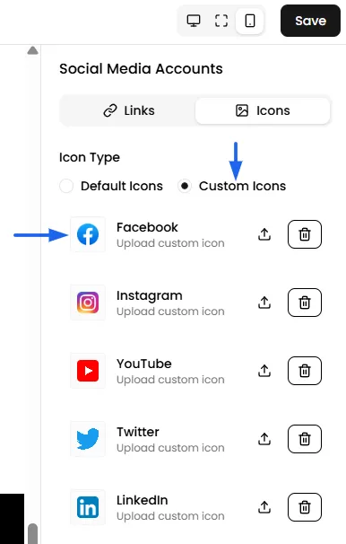
- Default Icon Style: You have the option to make use of the default icons, if they align with your brand.
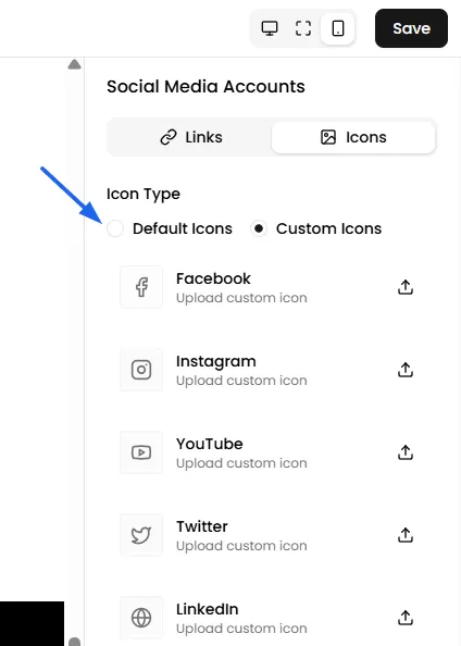
- Upload Custom Icons: You also have the option to upload your own custom-designed icon images for each social media platform.