Discovery Page
The Discovery Page is a dynamic space where users can explore merchants, discover exciting offers, and engage with featured content on your platform. This page acts as a storefront for your platform, helping users easily navigate through merchant listings, promotional banners, and product highlights.
You can customize this page to include banners for special offers or store ads with external links, showcase featured products, and add tailored sections such as "Top-Selling Stores" or "Best-Rated Stores." The flexibility to design additional sections allows you to create a highly engaging and personalized experience that captures user interest.
Navigating to the Discovery Page
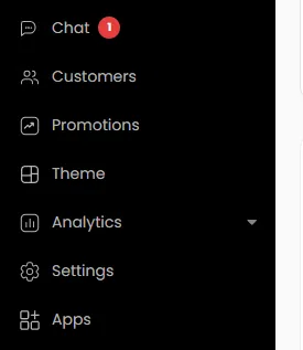
- From your main admin panel, click on Theme in the left-side navigation menu.
- The theme editor will open. At the very top of the screen is a dropdown menu. Click on it and select the Discovery page.

- Click to switch the view between Desktop or Mobile.


Hide/Unhide Sections
Utilize the eye icon to toggle the visibility of any element on the selected page. This allows you to easily hide or unhide the welcome banner or custom sections as needed.

Rearrange Sections
To rearrange the welcome banner or custom sections on the selected page, simply drag and drop them into your preferred order.

Customizing Sections with CSS
To modify the styling, shape, or make adjustments to an existing section, simply select the section you wish to customize. You can then apply Custom CSS to achieve the desired changes, tailoring each section’s appearance to your specific needs. This method can be used for any section on your discovery page.
To customize a section, select it from the list, open the CSS editor, and paste your custom code.
Basic knowledge of HTML and CSS is required to customize these sections. If you're not familiar with coding, you may need to work with a CSS designer to implement advanced customizations
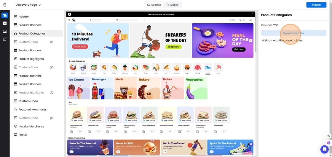
Header
The Header is the very top section of your website that appears on every page.

- Click on the Header in the section list to edit.
- You can edit Custom CSS, which allows designers to style the header beyond standard options, such as adding a border, changing its color, or applying other custom styling.

Hero Banner
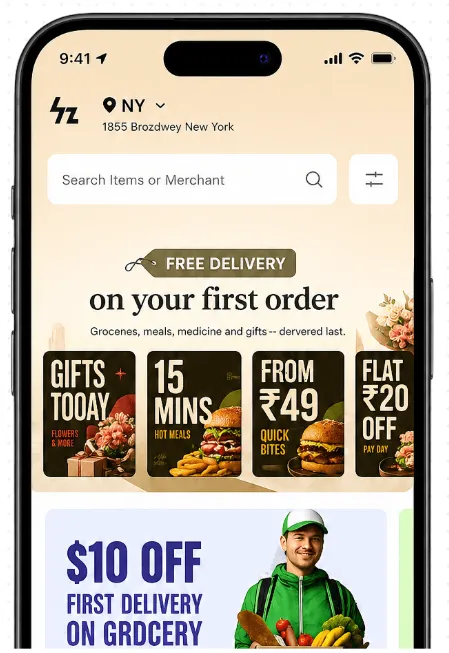
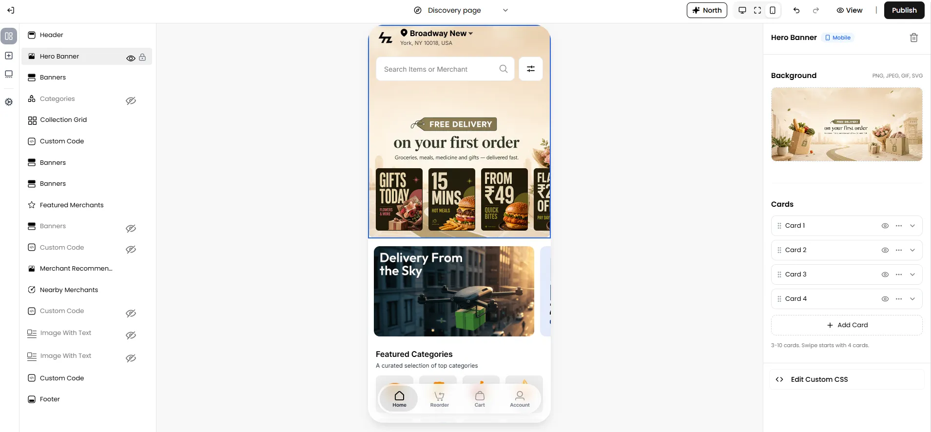
The Hero Banner allows you to create an engaging promotional section that helps customers discover featured offers, merchants, products, or collections as soon as they open your marketplace.
The Hero Banner consists of a large background banner along with multiple promotional cards. Each card can display a custom image and can be configured to redirect customers to a specific destination such as a merchant or merchant category. This makes it an effective way to highlight seasonal campaigns, limited-time offers, featured merchants, new arrivals, or important announcements while improving product and merchant discovery.
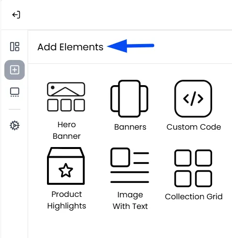
Accessing the Hero Banner
To configure the Hero Banner:
- Navigate to Admin Panel > Settings > Theme Builder.
- Select the Hero Banner section from the page components.
- Once added, you can configure the banner and promotional cards as required.
Note: Ensure you are on Mobile view in the Theme Builder to view the Hero Banner. The Hero Banner is displayed at the top above all other components.
Configuring the Background Banner
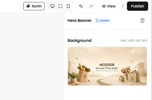
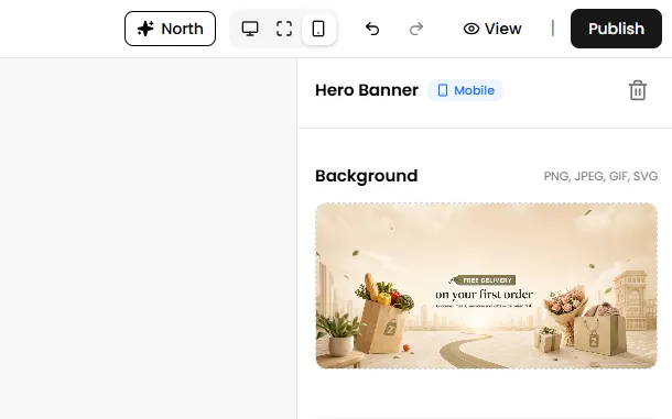
The Background section controls the large banner displayed behind the promotional cards. This banner acts as the primary visual element of the Hero Banner section.
Note: The Hero Banner background supports PNG, JPEG, GIF, and SVG image formats.
Configuring Promotional Cards
The Hero Banner supports multiple promotional cards that are displayed on top of the background banner. For each card, you can configure:
Note: Each Hero Banner must contain a minimum of 3 cards and can have a maximum of 10 cards. By default, the section is created with 3 cards. If you add more than four cards, customers can swipe on the Discovery Page to view the remaining promotional cards.
Action
Select where customers should be redirected when they click the card.
Depending on your storefront configuration, cards can be linked to destinations such as:
- Merchant: Takes the customer directly to a specific merchant's storefront.
- Merchant Category: Takes the customer to a page showing all merchants that belong to a specific category.
Note: If no action is configured, the promotional card will be displayed visually but will not redirect customers to any destination when clicked.
Note: Click the three-dot menu on any card to access additional management options:
- Duplicate: Creates an exact copy of the selected card, including its image and configuration.
- Remove: Deletes the selected card from the Hero Banner.
You can also drag and drop the promotional cards using the drag icon to rearrange their order in the list.
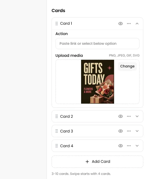
Upload Media
Upload the promotional image that will be displayed for that card.
Note: Each promotional card supports PNG, JPEG, GIF, and SVG image formats. The uploaded image is displayed in a 3:4 aspect ratio and will be automatically cropped to fit the available card space. For the best results, use images designed in the same aspect ratio to avoid important content being cropped.
Publishing Changes
Once you have finished configuring the Hero Banner:
- Review the live preview within the Storefront Builder.
- Click Publish.
- Refresh your storefront to view the updated Hero Banner on the Discovery Page.
Banners
Banners are a versatile tool on the Discovery Page, designed to grab attention and highlight key promotions. Whether showcasing discounts, promoting specific stores, or linking to external third-party websites, banners offer a dynamic way to engage users. They can also be used to feature ads or redirect customers to merchant categories or store menus for seamless navigation. This is where you can instantly communicate your most important messages:
- Promote Platform-Wide Sales:" Mega Monsoon Sale - 20% Off Everything!"
- Showcase New Merchants:" Welcome, Rominos Pizza! Now Delivering!"

How to Configure the Main Banner Section
First, click on Banners in the main section list on the left. This opens the control panel for the entire banner area.

Title & Description
These are optional headings that appear above the banner slideshow on the Discovery Page.


Layout
The Layout controls the shape and orientation of your banners.

Choose the layout for your banners from four options: Horizontal, Vertical, Square, or Strip, depending on how you want the banners to appear on the Discovery Page. You can preview each layout directly in the middle of the builder screen to ensure it matches your desired design.


Auto-Scroll Banners
Enable the toggle if you want the banners to scroll automatically, creating a dynamic and engaging user experience.

How to Add and Edit an Individual Banner
In the "List of banners," either click Add to create a new banner from scratch or edit an existing one.

Title: A name for the banner that is for your internal reference only. Customers will never see this.

Status: Controls whether the banner is live or hidden.

The "Button link": Turning a Picture into a Powerful Action
It determines what happens when a customer taps on a Banner.

- None: The banner will not be clickable. Solely used for presentation purposes.
- When to use it: This should only be used for purely informational banners where there is no logical next step for the customer (e.g., a simple "Happy Holidays!" banner).


- External Link: Sends the customer to a specific webpage outside of your app or website.
- Use Case: Your banner shows a blog of the marketing team for "5 Healthy and Delicious Breakfast Recipes You Can Make in 10 Minutes." You can link the banner directly to their blog post.


- Search Term: Takes the customer to the search results page for a word or phrase you define.
- Use Case: It’s Friday evening, and you want to run a “Pizza Night” promotion to attract customers looking for an easy meal showcasing all pizza-related items across all stores on your platform.


- Merchant: Takes the customer directly to a specific merchant's storefront.
- Use Case: Your banner says "Roti Hypermarket - 15 Minute Delivery!". You link the banner to the "Roti Hypermarket" merchant. When a customer taps it, they are taken straight to that store's page, ready to start shopping.


- Merchant Category: Takes the customer to a page showing all merchants that belong to a specific category.
- Use Case Example: You're launching a "Step Up Your Style" campaign to promote all the shoe stores on your platform. Your goal is to guide customers who are looking for new footwear to a single page that lists all their options


Sort Banners
Drag and drop banners using the drag icon to rearrange their order in the list.

Categories (Business Category)
Think of the Categories section as the digital equivalent of the large, helpful aisle signs in a physical supermarket.
Note: On the Discovery Page, you can only link merchants to business categories. If you want to display products from a specific category of a particular merchant, you can use the Product Highlights section to showcase that category from the desired merchant.


Categories View
The Categories View allows you to organize and showcase products or services into different sections, making it easier for customers to browse and quickly find what they are looking for.

- Scroll: Single Row: This option arranges all your category icons into a single, clean, horizontal line that customers can swipe through from left to right.


- Scroll: Double Row: This option is a balance between the single row and the full grid. It arranges your categories into two horizontal, swipeable rows.


- No Scroll: Multiple Rows: This option displays all your categories at once in a static grid format. Instead of swiping the section left and right, the customer scrolls down the page to see all the category icons.


Custom CSS: This allows you to add your own CSS rules to make specific style changes to the Categories section that are not available in the predefined options.

Product Highlights
This adds a curated, swipeable list of specific products from a single, designated merchant. It allows you to shift the focus from a store to its specific products, tempting customers with beautiful product images directly on the Discovery Page.

Configuring the Content: This is where you tell the system exactly which products to display. Simply select Product Highlights, then proceed.
- Select Merchant: This dropdown menu lists all the active merchants on your platform. You must choose one merchant for this section to pull products from.

- Select Category: After you've chosen a merchant, this second dropdown will populate with all the product categories that belong to that specific merchant. Select the category of products you want to showcase.

Configuring the Mobile Layout: This setting controls how the product showcase will look on a mobile phone
- Single Row Scroll: This displays the products in a single, clean, horizontal line that customers can swipe through.

- Stacked Grid: This displays the products in a two-column grid. The customer scrolls down the page to see all the items in the highlight section.

AI-based Merchant Recommendations
The "Recommended For You" section will act as a personalized welcome mat for every user and will suggest products for a seamless shopping experience.

- For Your Regulars: When a logged-in customer arrives, the AI analyzes their past orders and preferences to showcase stores they're most likely to love.
- For New Visitors: For guests who aren't logged in, the system automatically highlights your most popular and trending stores, ensuring newcomers see the best your platform has to offer right away.
Featured Merchants: Your Hand-Picked Showcase
The "Featured Merchants" section is a prominent, curated showcase on your Discovery Page where you can hand-pick specific stores to highlight. It allows you to strategically guide customer attention to the businesses you want to promote most.


Nearby Merchants
The "Nearby Merchants" section is a smart, dynamic, and personalized list that shows customers the stores that are physically closest to their current location. This is the core of a "quick commerce" platform, which automatically connects customers with the most convenient options for the fastest possible delivery.
The primary option is Edit Custom CSS, for users to add custom styling.


Footer (Customizing with CSS)
Click Footer in the main section list and use the Edit Custom CSS button. You can add custom code here to change font sizes, add borders, or customize colors.


Frequently Asked Questions (FAQ)