Add Elements and Upload Assets
This section enables you to enhance your store by adding extra components, such as banners (to showcase offers), Custom Code (for advanced HTML/CSS changes), Product Highlights (to feature key products), and Image with Text blocks (for visual storytelling). These elements give you the flexibility to go beyond the default template and create a more personalized shopping experience.
How to Add a New Element
- Navigate to the Admin panel > Theme (Appearing in the left panel) and select the page that you wish to customise from the Dropdown option.
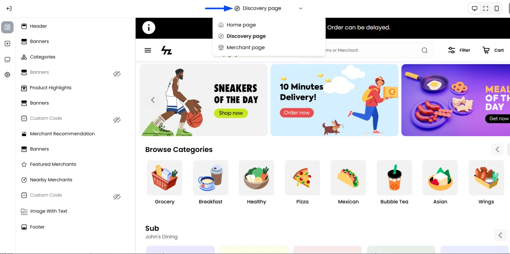
- In the left vertical bar of the editor, click the plus icon.
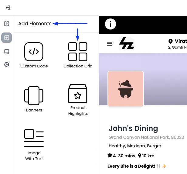
- The "Add Elements" panel will open, displaying a list of all available content blocks that you can add to your page.
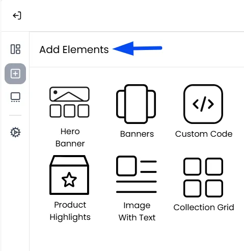
Hero Banner
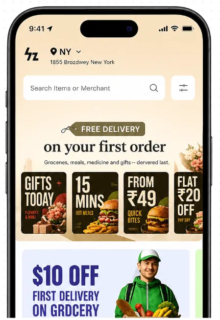
The Hero Banner allows you to create an engaging promotional section that helps customers discover featured offers, merchants, products, or collections as soon as they open your marketplace.
The Hero Banner consists of a large background banner along with multiple promotional cards. Each card can display a custom image and can be configured to redirect customers to a specific destination such as a merchant or merchant category. This makes it an effective way to highlight seasonal campaigns, limited-time offers, featured merchants, new arrivals, or important announcements while improving product and merchant discovery.
Note: The Hero Banner is supported in both business models: Single Vendor and Marketplace.
Accessing the Hero Banner
To configure the Hero Banner:
- Navigate to Admin Panel > Settings > Theme Builder.
- Select the Hero Banner section from the page components.
- Once added, you can configure the banner and promotional cards as required.
Note: Ensure you are on Mobile view in the Theme Builder to view the Hero Banner. The Hero Banner is displayed at the top above all other components.
Configuring the Background Banner
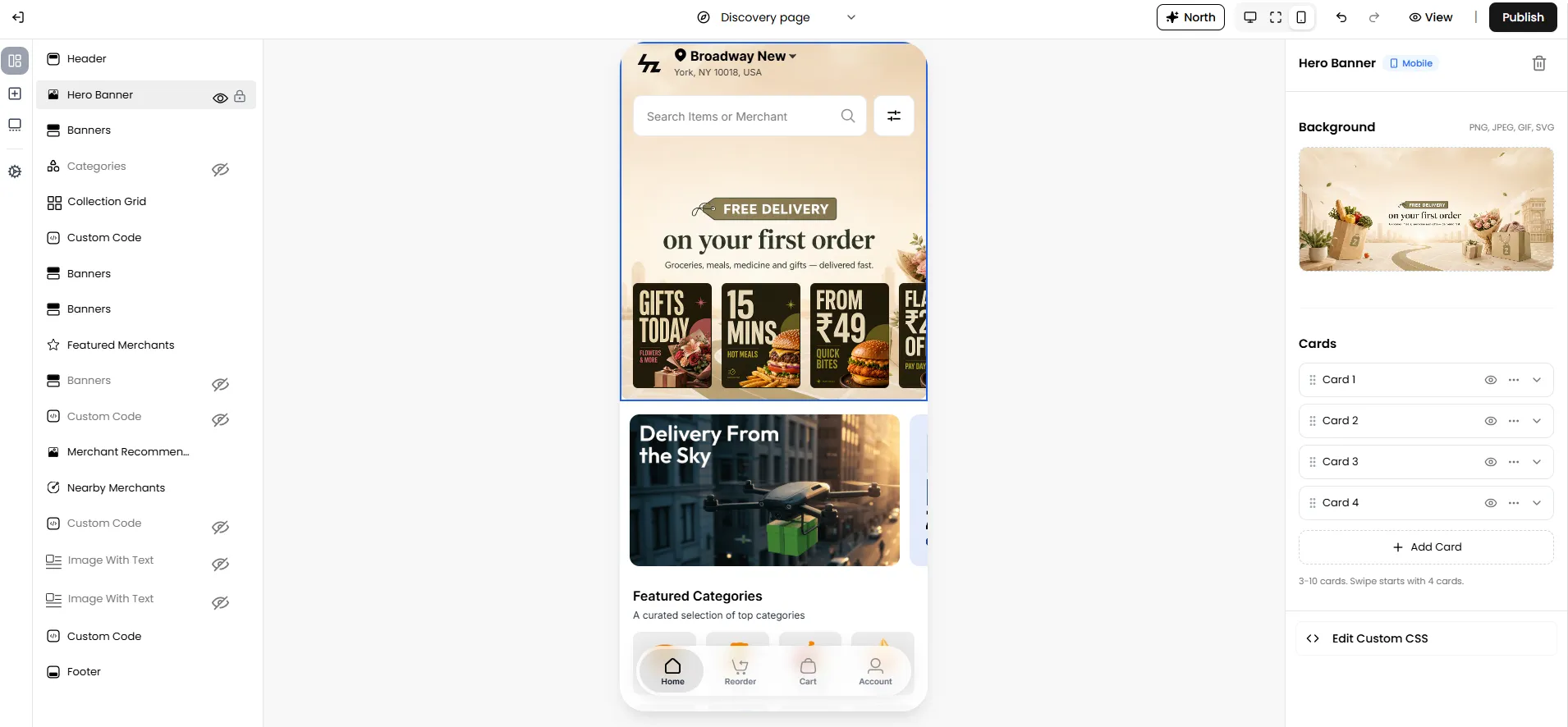
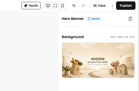
The Background section controls the large banner displayed behind the promotional cards. This banner acts as the primary visual element of the Hero Banner section.
Note: The Hero Banner background supports PNG, JPEG, GIF, and SVG image formats.
Configuring Promotional Cards
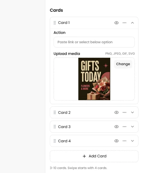
The Hero Banner supports multiple promotional cards that are displayed on top of the background banner. For each card, you can configure:
Note: Each Hero Banner must contain a minimum of 3 cards and can have a maximum of 10 cards. By default, the section is created with 3 cards. If you add more than three cards, customers can swipe on the Discovery Page to view the remaining promotional cards.
Action
Select where customers should be redirected when they click the card.
Depending on your storefront configuration, cards can be linked to destinations such as:
- Merchant: Takes the customer directly to a specific merchant's storefront.
- Merchant Category: Takes the customer to a page showing all merchants that belong to a specific category.
Note: If no action is configured, the promotional card will be displayed visually but will not redirect customers to any destination when clicked.
Note: Click the three-dot menu on any card to access additional management options:
- Duplicate: Creates an exact copy of the selected card, including its image and configuration.
- Remove: Deletes the selected card from the Hero Banner.
You can also drag and drop the promotional cards using the drag icon to rearrange their order in the list.
Upload Media
Upload the promotional image that will be displayed for that card.
Note: Each promotional card supports PNG, JPEG, GIF, and SVG image formats. The uploaded image is displayed in a 3:4 aspect ratio and will be automatically cropped to fit the available card space. For the best results, use images designed in the same aspect ratio to avoid important content being cropped.
Publishing Changes
Once you have finished configuring the Hero Banner:
- Review the live preview within the Storefront Builder.
- Click Publish.
- Refresh your storefront to view the updated Hero Banner on the Discovery Page.
Banners
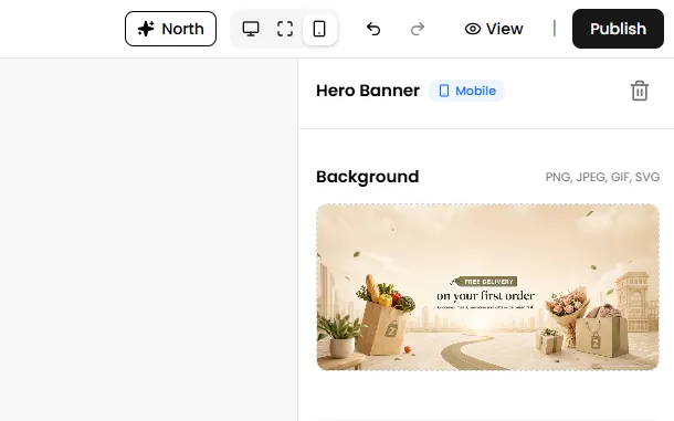
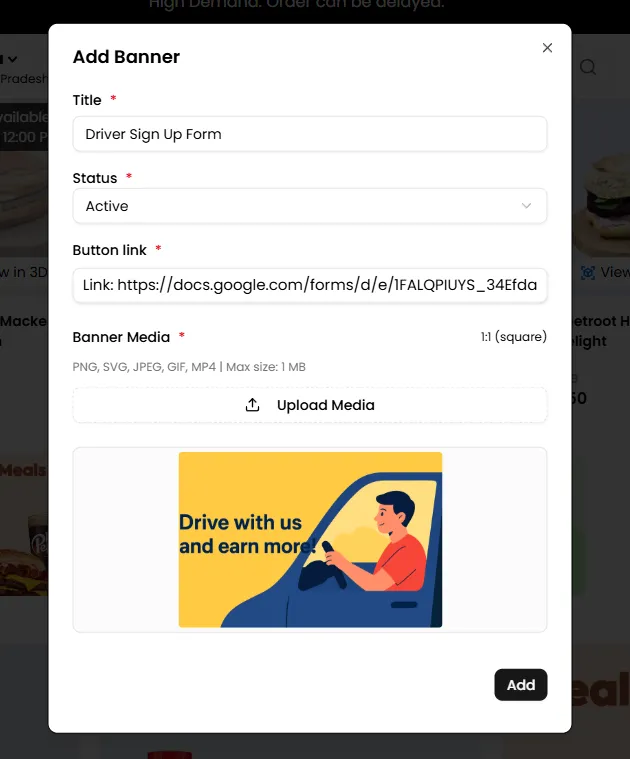
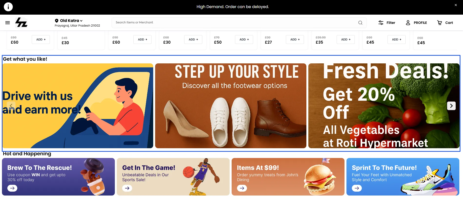
This adds a new, independent "Banners" section to your page. The ability to add more banner sections allows you to place targeted advertisements and promotions at different points in the customer's browsing journey. For Example:-
Driver/Merchant Recruitment: A banner doesn't always have to be for customers. You can add a banner near the bottom of the page with the text "Drive with us and earn more!" linking to your driver sign-up page.
Custom Code
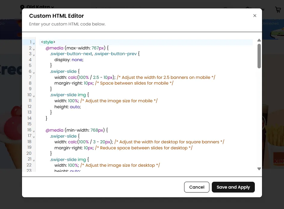
This adds a blank section where a user can insert custom HTML and CSS code to build a unique content block from scratch.
Basic knowledge of HTML and CSS is required to customize these sections. If you're not familiar with coding, you may need to work with a CSS designer to implement advanced customizations.
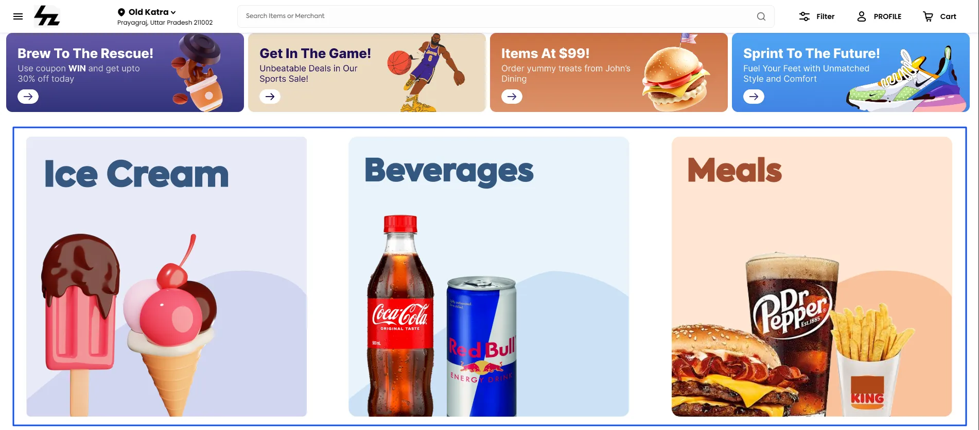
Creating a "Shop by Department" Visual Menu: The "Categories" section on the Discovery page displays small icons for different departments. Click on the Custom Code element to add it to your page and use HTML and CSS to customize the look, such as enlarging the category icons or changing their style to match your design.
Product Highlights
The Product Highlights feature adds a curated, swipeable list of specific products from a single, designated merchant. It allows you to shift the focus from a store to its specific products, tempting customers with beautiful product images directly on the Discovery Page.
To add the Product Highlights section, simply select Product Highlights, then proceed.
- Select Merchant: The dropdown menu lists all the active merchants on your platform. Choose one merchant for this section to pull products from.
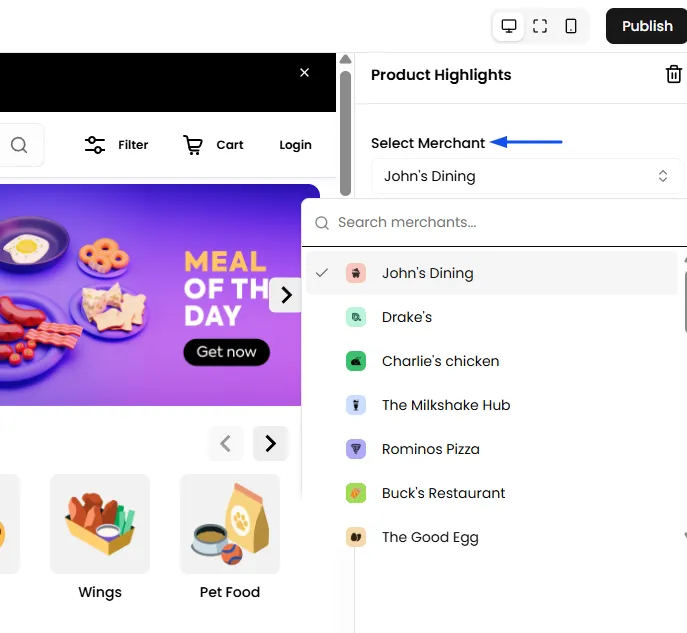
- Select Category: After you've chosen a merchant, the second dropdown will populate with all the product categories associated with that specific merchant. Select the category of products you want to showcase.
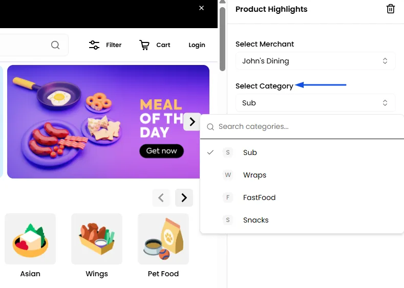
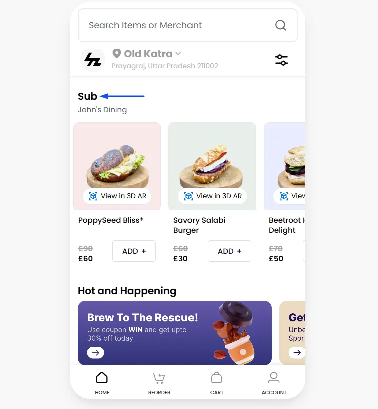
Configuring the Mobile Layout: This setting controls how the product showcase will look on a mobile phone
- Single Row Scroll: It displays the products in a single, clean, horizontal line that customers can swipe through.
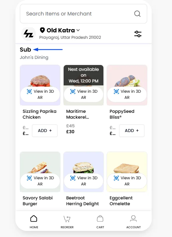
- Stacked Grid: It displays the products in a two-column grid. The customer scrolls down the page to see all the items in the highlight section.
Collection Grid
Once you select the "Collection Grid" feature from the Elements list, it will appear in the section stack. This section is designed to create main categories and link subcategories under them, making it particularly useful for Grocery, Pharmacy, or stores with a large number of items.
Configure a Collection Grid
Add the Collection Grid from the Add Elements panel.
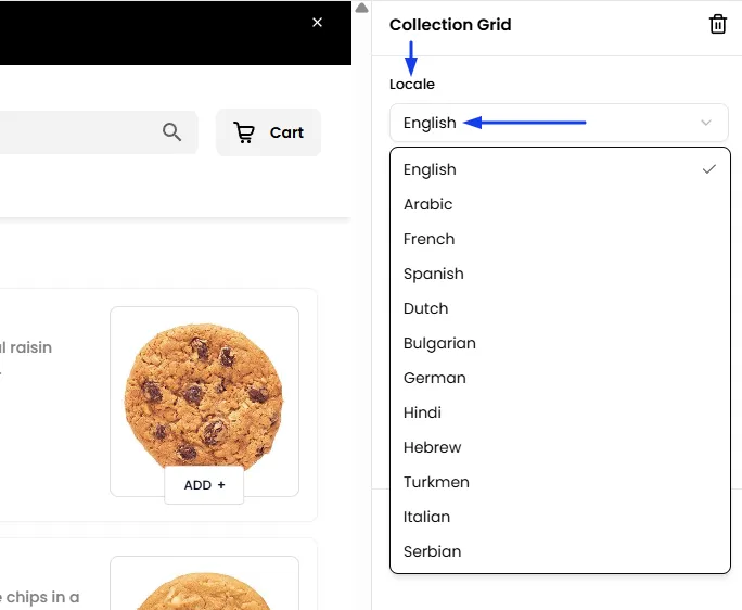
Add Info in Preferred Languages
Tailor your Collection information to customer choices. Use language settings to add or remove options or choose the default language of your store. This feature allows you to input and present store details in the customer's chosen language. For example, if a customer selects Spanish, all added information will be displayed in Spanish for them.
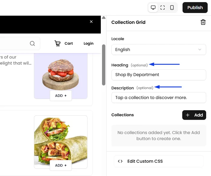
Add a Title and Description
Provide a title to name your collection grid section. For instance, if you're creating a "Shop by Department" section, you can use this field to label it. Additionally, you can include a brief description below the title to offer more context.
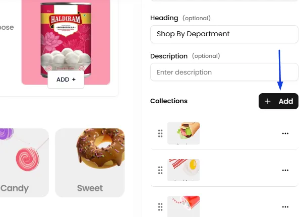
Add a Category Collection
- To add, click "Add New"
Upload Image
- If you'd like the category name to appear inside the image icon, include it directly in the image itself. Otherwise, you can enter the name separately in the Category name field.
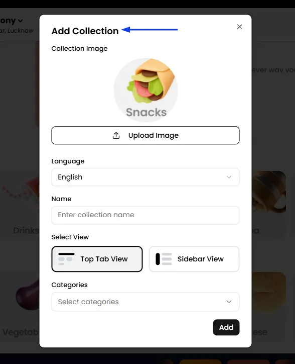
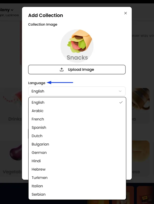
Add Information in Preferred Languages
- Tailor the collection name to suit customer preferences by using language settings to add or remove options or choose the default language of your store. Input and display details in the customer’s selected language. For example, if a customer chooses Spanish, the information will automatically appear in Spanish.
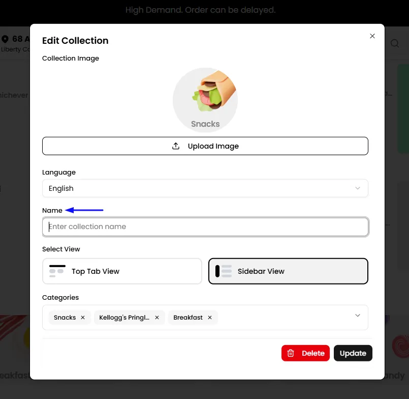
Enter Category Name
- Provide a category name that will appear below the image. If the category name is already included within the uploaded image, you can skip this step.
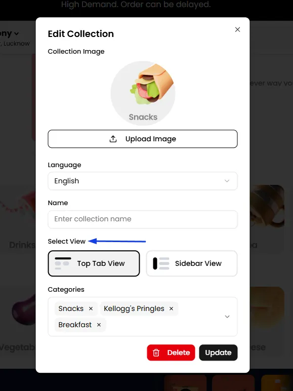
Select View
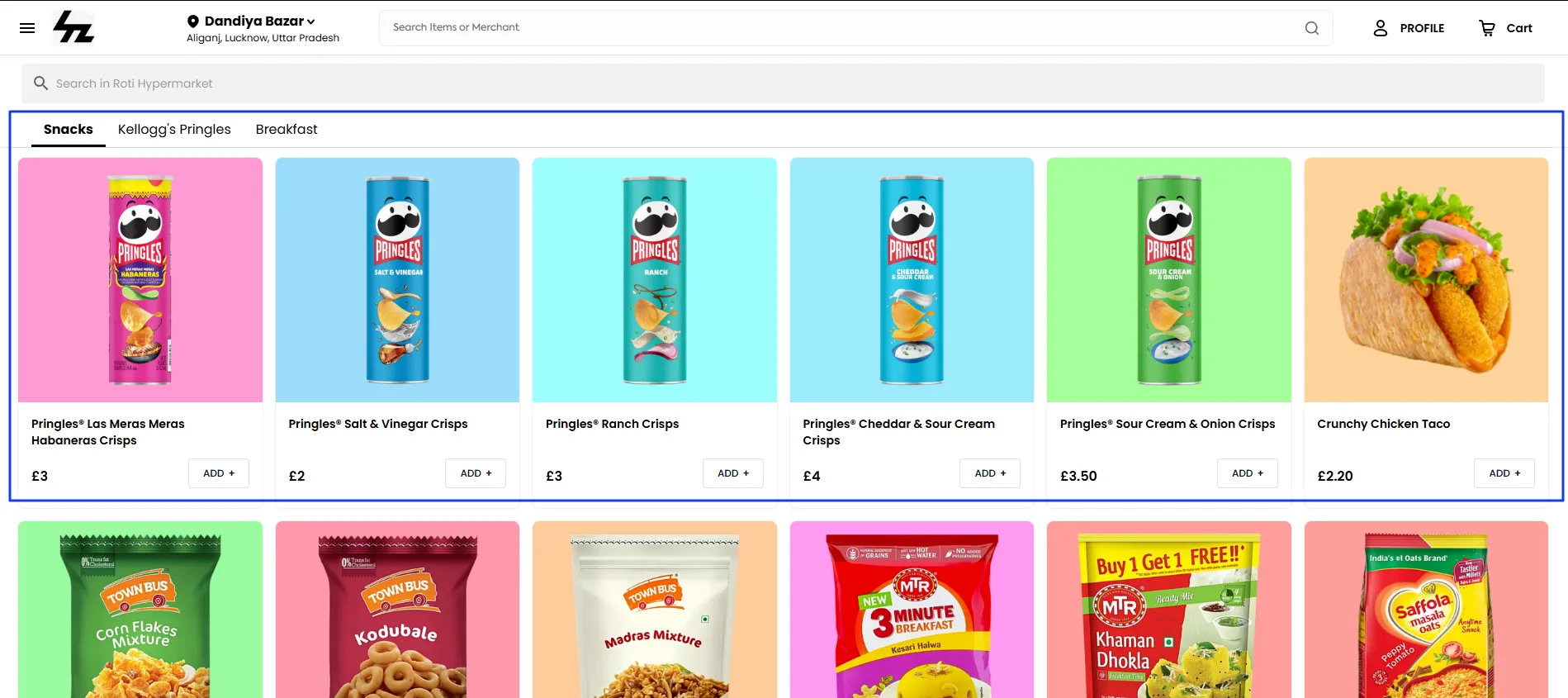
Top Tab View: When a customer clicks on your collection (e.g., "Breads"), they will be taken to a new page where the sub-categories you linked (Sourdough, Whole Wheat, Buns, Rolls) are displayed as a clean, horizontal, swipeable tab menu at the top of the page. The products will be shown below.
Sidebar View: When a customer clicks on your collection, they will be taken to a new page that is split into two columns. On the left, there will be a vertical list of the sub-category names. On the right, the products for the selected sub-category will be displayed.
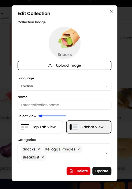
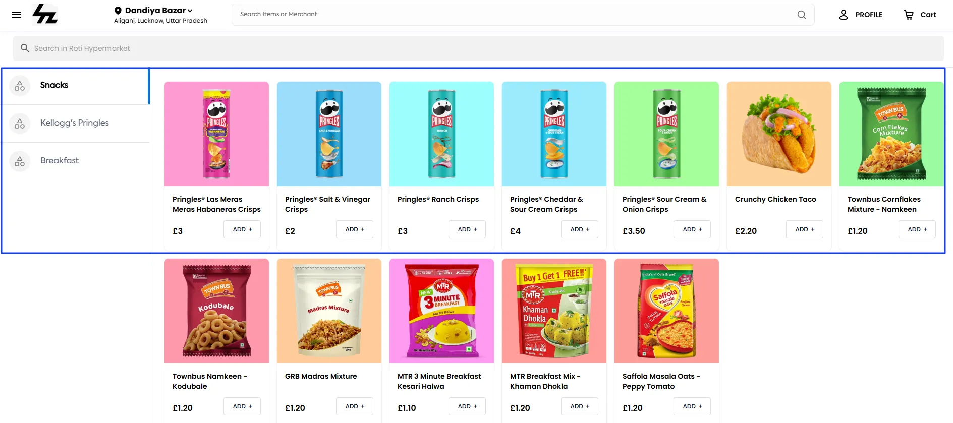
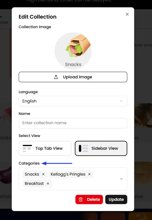
Select Subcategories
- Choose the subcategories you want to link under this main category. You can select multiple subcategories as needed to offer a comprehensive view.
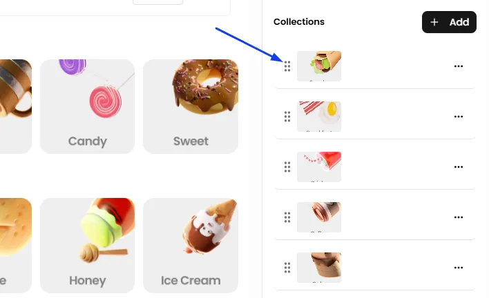
Sort Collections
- Drag and drop collections using the drag icon to rearrange their order in the list.
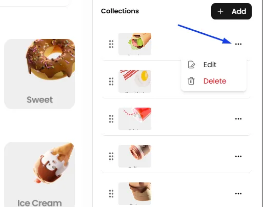
Edit Collections
- Click on any collection to open it and make edits as needed.
Merchant Collection
The Merchant Collection section allows you to showcase merchants or business categories on your ordering storefront in a dedicated, customizable section. It can be used to help customers discover specific businesses, explore merchants by category, or highlight curated collections such as Featured Merchants, Popular Near You, and Top Restaurants. When creating a Merchant Collection, you can choose whether to display specific merchants or organize the collection by Business Category. Then customize the heading, description, layout, color scheme, and other styling options to match your theme. This gives you flexibility to create different types of discovery sections depending on how you want customers to browse and discover businesses.
Add a Merchant Collection
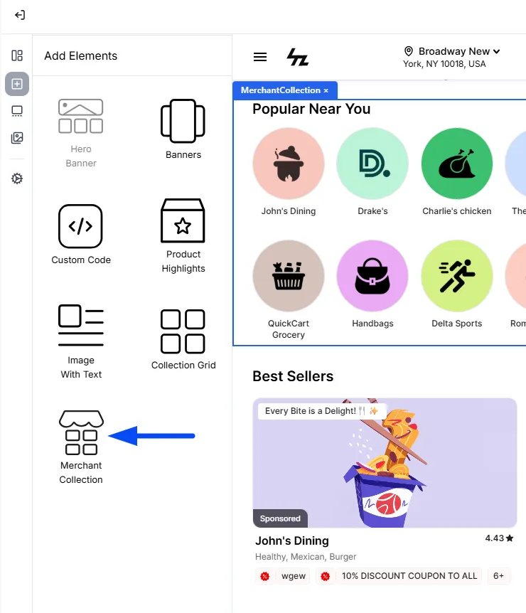
- From the left panel, click Add Elements.
- Select Merchant Collection.
- The Merchant Collection section will be added to the page.
- Select the section to open its configuration options.
Configure Merchant Collection
Once the Merchant Collection section is added, you can configure its content and appearance from the settings panel.
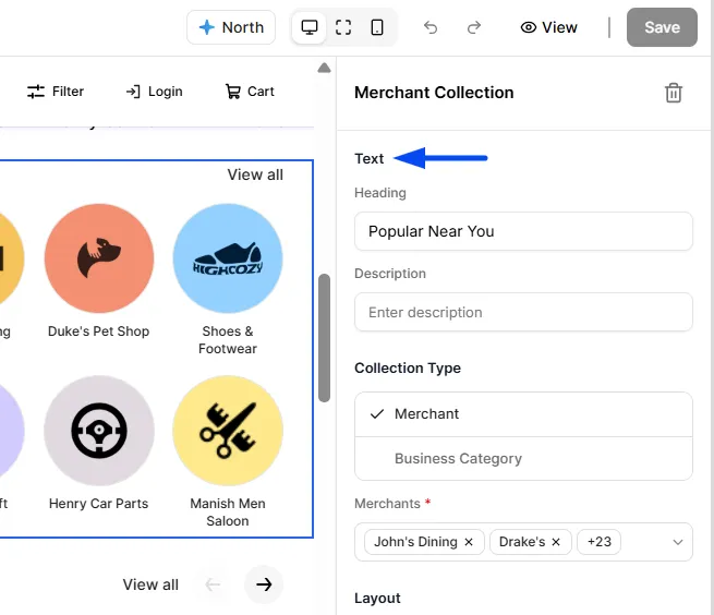
Add a Heading and Description
You can add a Heading and Description for the collection. The heading identifies the collection, while the description can provide additional information to customers.
Example:
Heading: Featured Merchants Description: Explore some of our most popular local businesses.
Choose the Collection Type
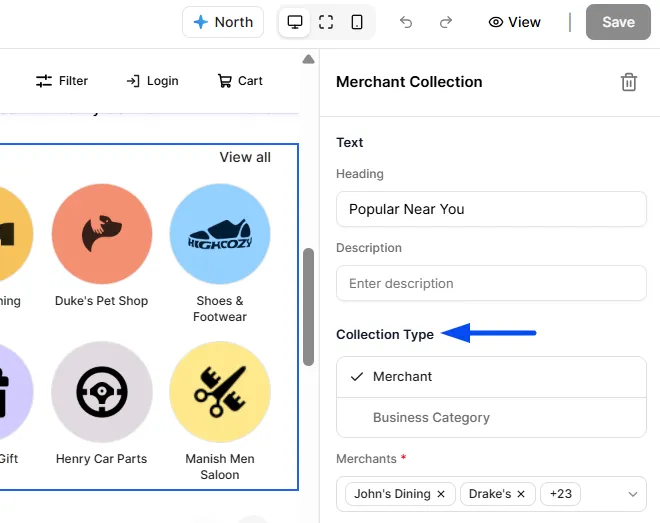
Under Collection Type, you can choose how the collection should be created:
- Merchant: Select specific merchants that you want to display.
- Business Category: Create the collection based on business categories.
Merchant
Select Merchant when you want to manually choose the specific merchants that should appear in the collection.
After selecting Merchant, use the Merchants field to search for and select the merchants you want to include. You can select multiple merchants in the same collection.
Business Category
Select Business Category when you want to organize or showcase merchants based on their business category instead of manually selecting individual merchants.
For example, a section titled Explore Restaurants can be used to help customers discover merchants belonging to the restaurant category.
Choose a Layout
Under Layout, you can choose how the collection is displayed on your ordering storefront.
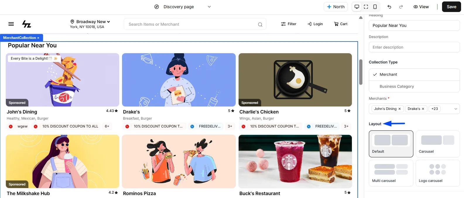
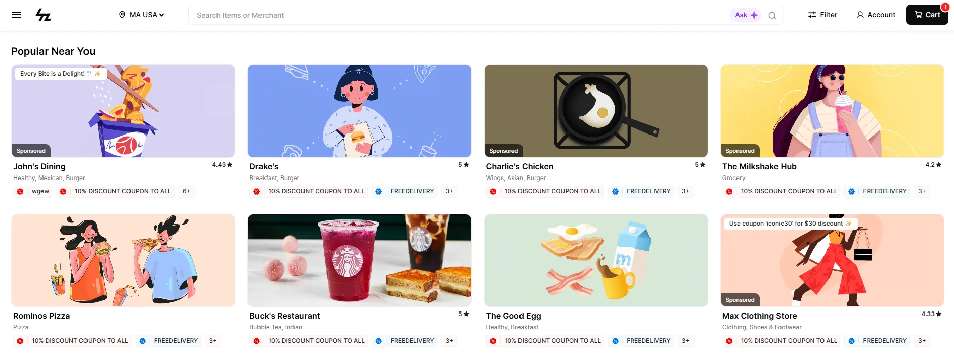
Default
Displays the collection using the standard layout. This can be useful when you want the collection to have a straightforward merchant presentation.
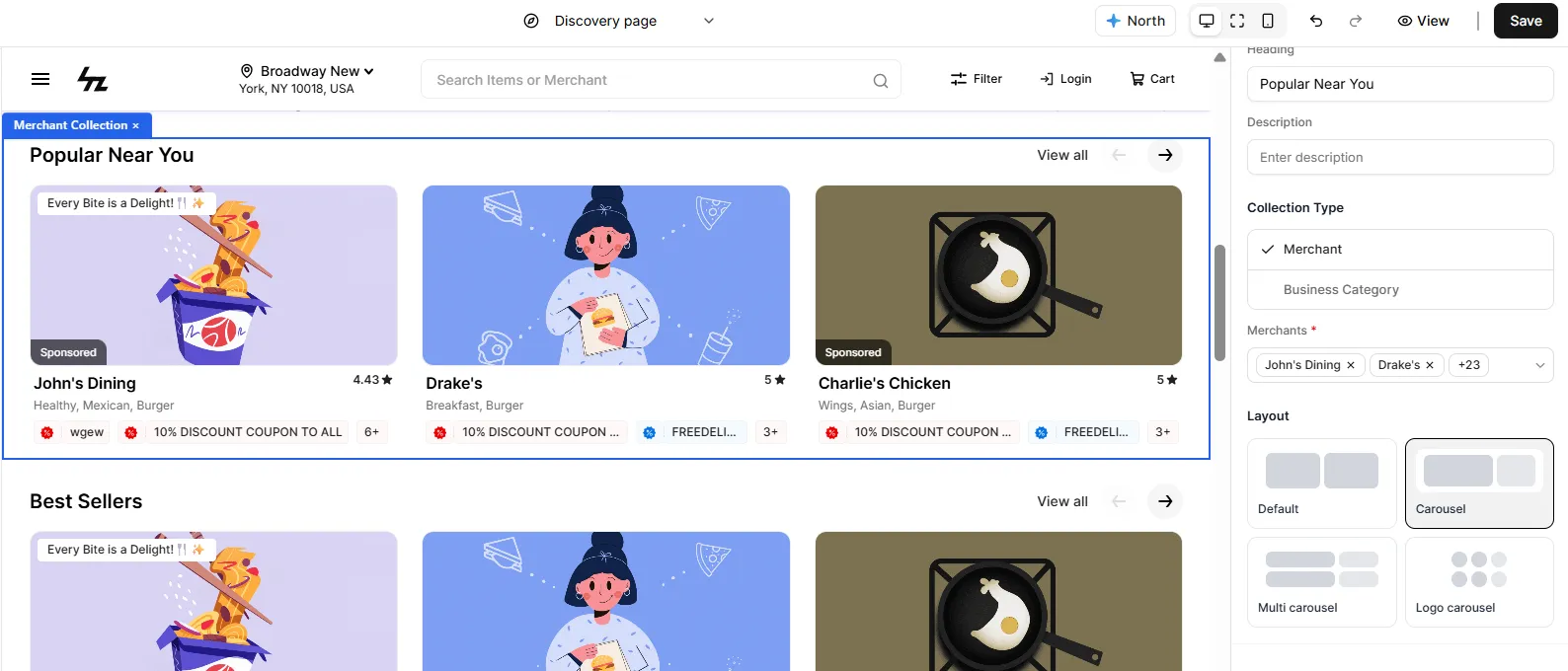
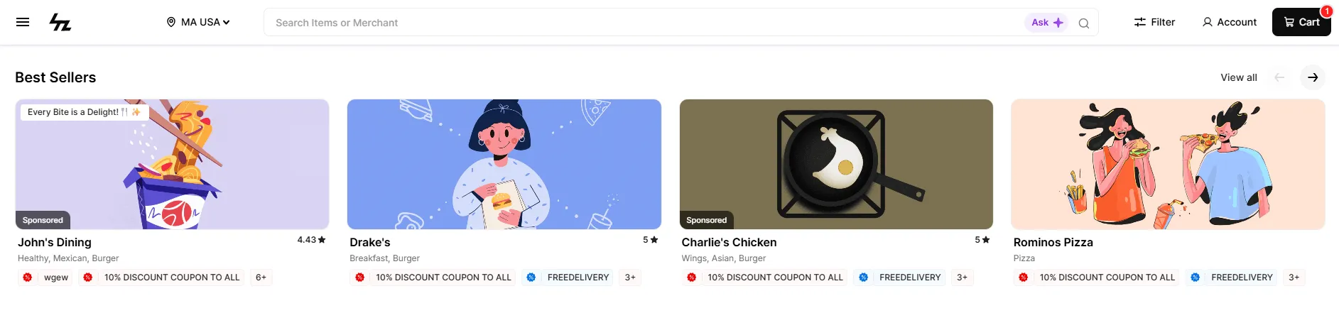
Carousel
Displays merchants in a horizontally scrollable carousel. This is useful when you have several merchants but want to keep the section compact.
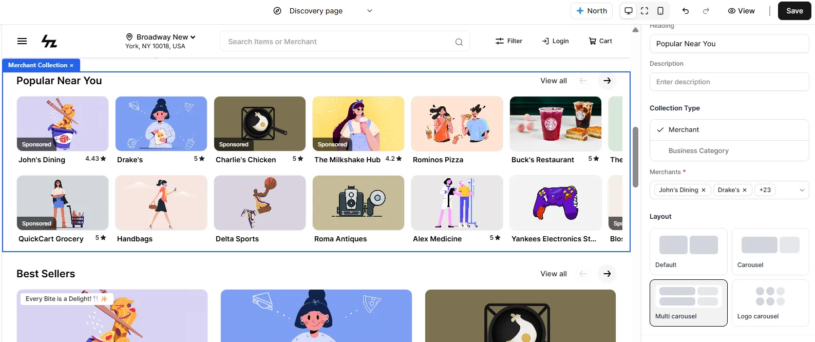
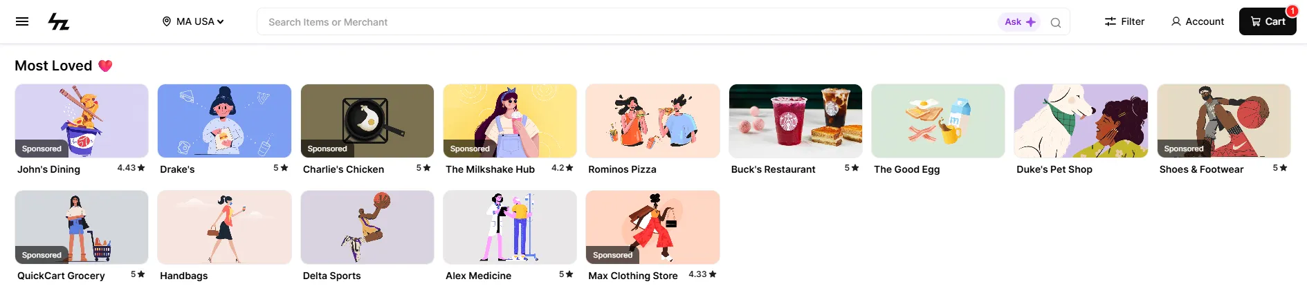
Multi Carousel
Displays merchants using multiple rows within a carousel-style layout. This can be useful when you want to display a larger number of merchants while still keeping the section organized.
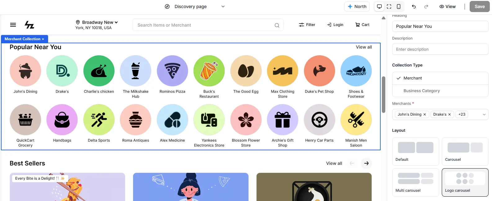
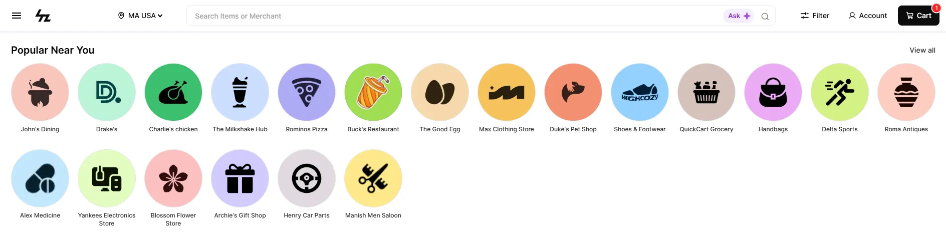
Logo Carousel
Displays merchants primarily through their logos in a compact layout. This is useful when merchant branding and quick discovery are the main focus.
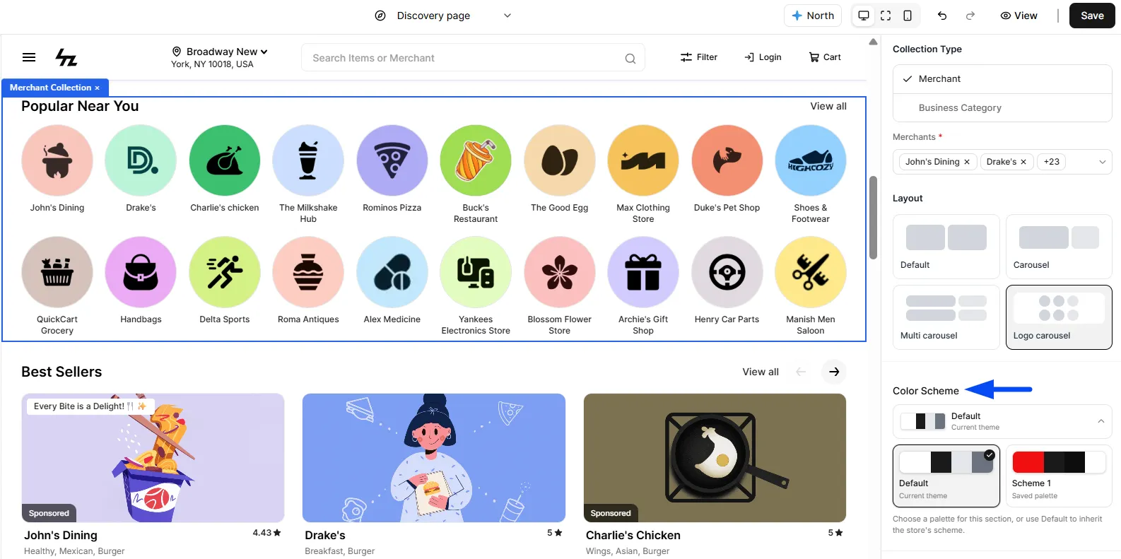
Configure the Color Scheme
The Color Scheme option allows you to apply a predefined color scheme to the Merchant Collection section.
You can create color schemes and then use them across your store sections to maintain a consistent visual style.
Note: You can refer to the Color Scheme guide for more information on creating and applying color schemes.
Customize with Custom CSS
The Edit Custom CSS option allows you to add custom styling to the Merchant Collection section.
This can be used when you need additional visual customization beyond the standard settings available in the Theme Builder.
Image With Text
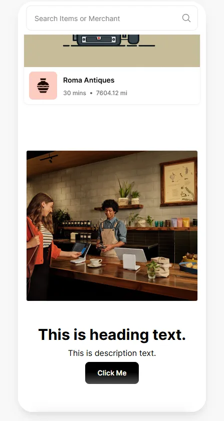
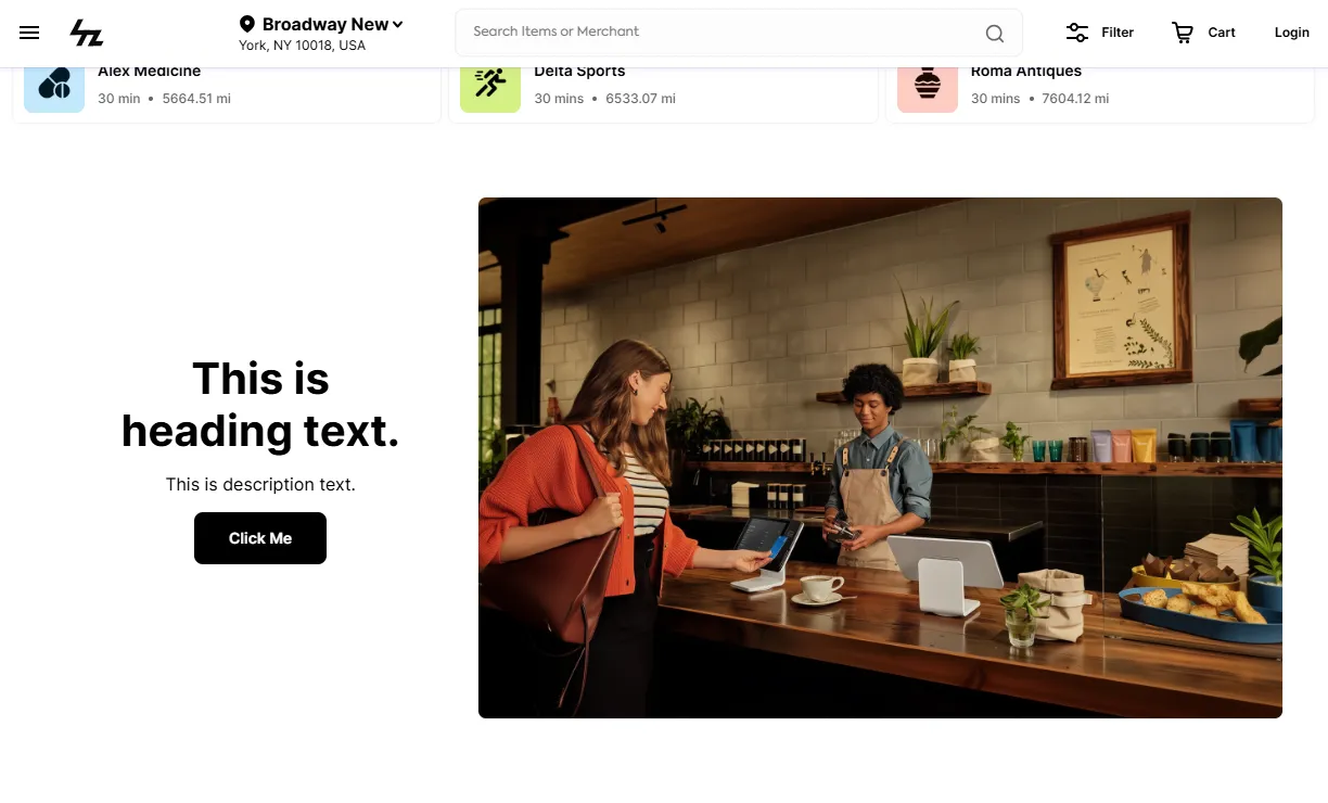
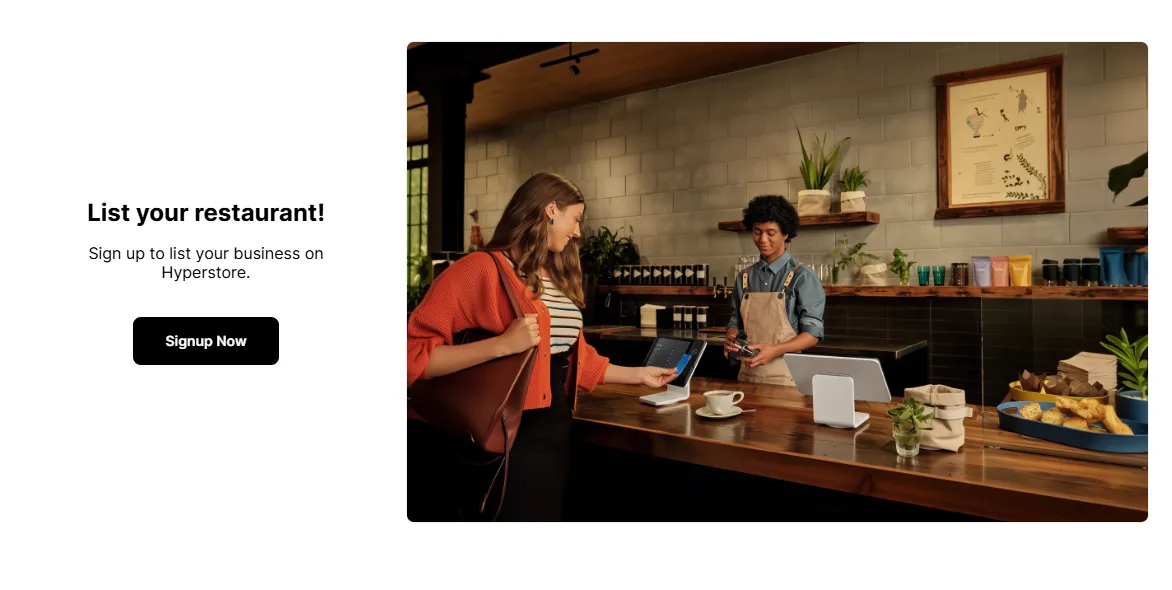
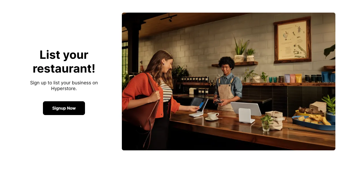
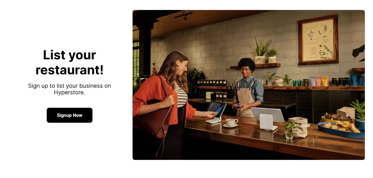
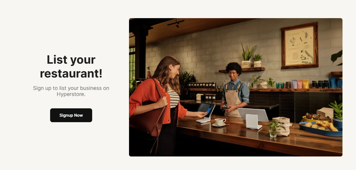
A simple but incredibly versatile element that creates a professional-looking content block with an image on one side and a heading and text on the other.
It's perfect for breaking up a long page of products and merchants with engaging storytelling.
Image Settings
Simply first click on the "Image to Text" from the elements tab, and then proceed.
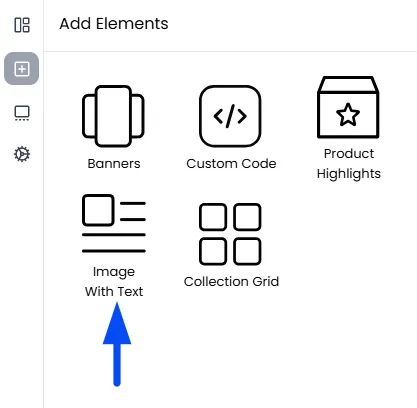
Image Upload
Upload a banner or visual that represents your content.
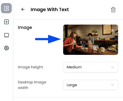
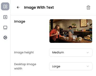
Image Size Controls
Adjust the image height and width to control how it appears across devices. Use these settings to ensure the image fits well and maintains a balanced layout.
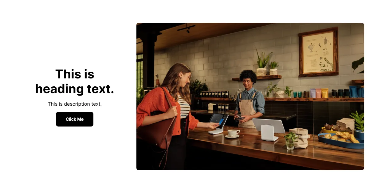
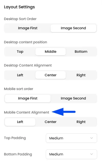
Layout Settings
This section controls how the image and text are arranged.
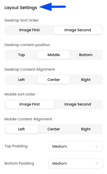
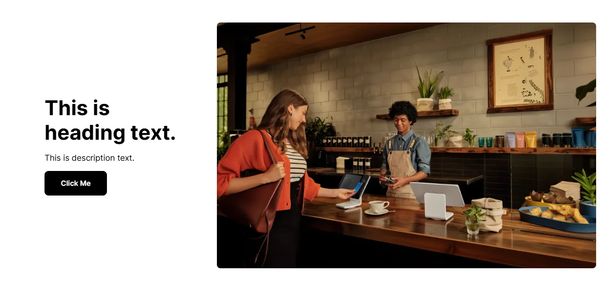
Desktop Sort Order
Control whether the image appears before or after the text in the section layout.
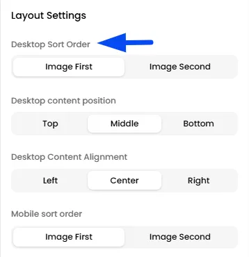
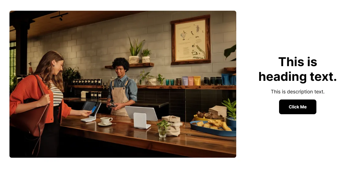
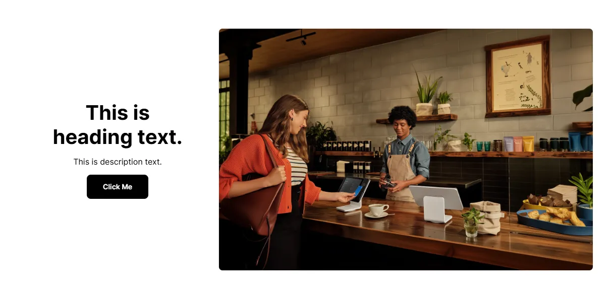
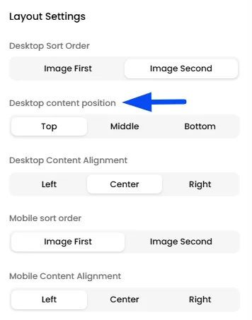
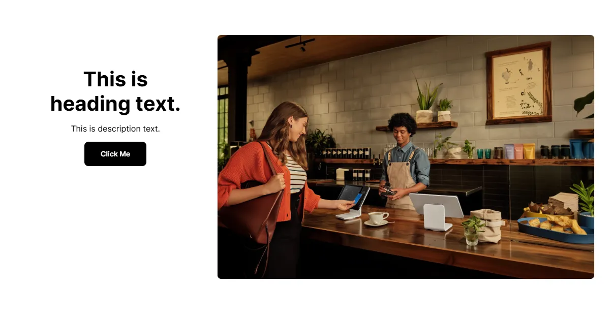
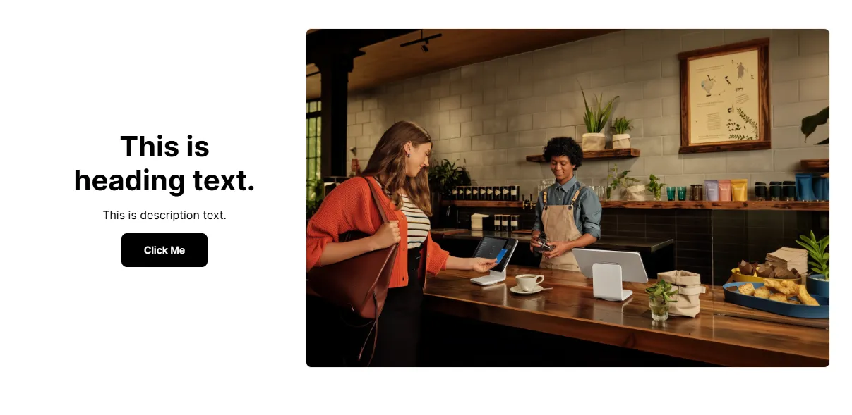
Desktop Content Position
Top / Middle / Bottom positioning of text relative to the image.
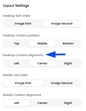
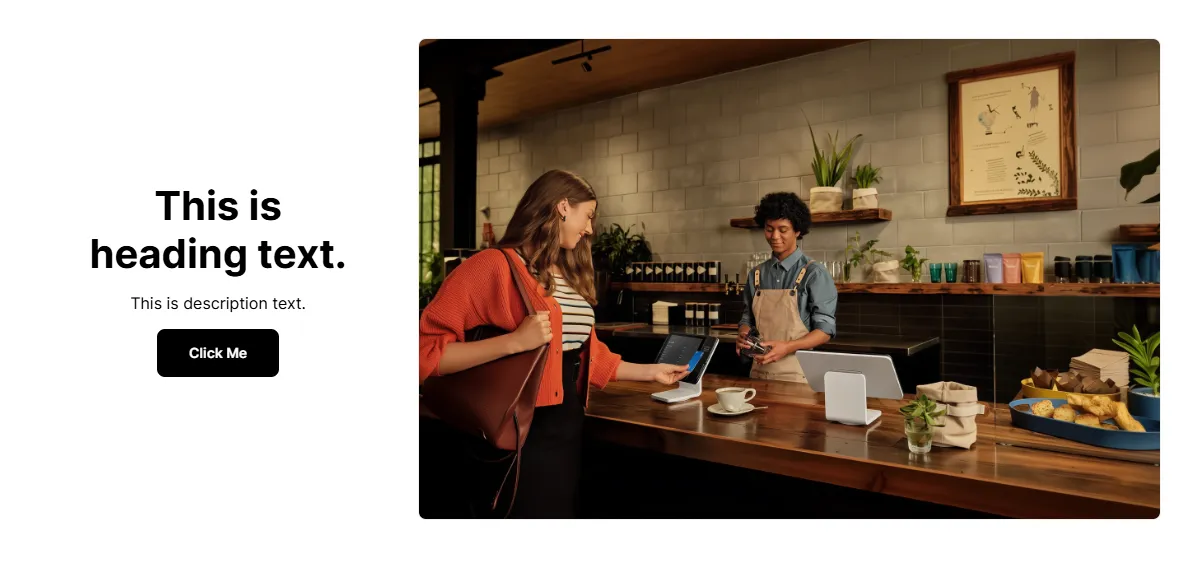
Desktop Content Alignment
Control how the text is aligned within the section (left, center, or right)
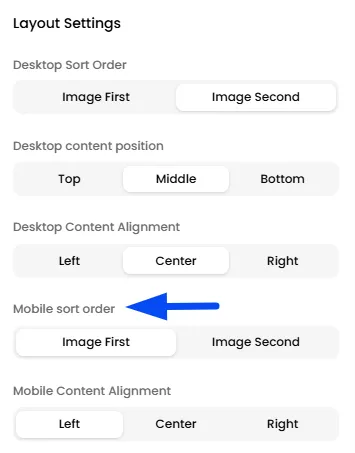
Mobile Sort Order
Choose how content stacks on mobile
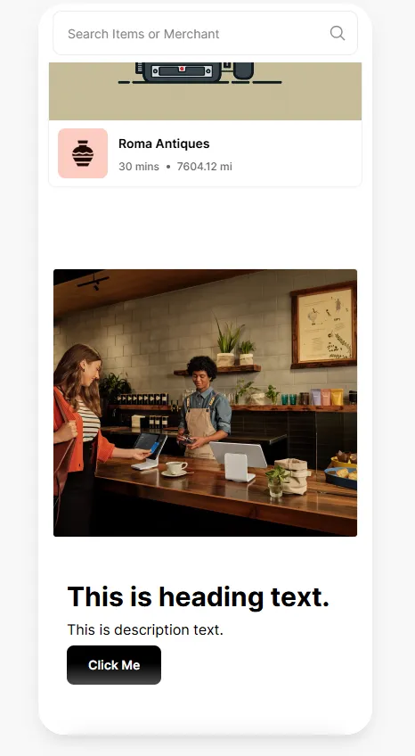
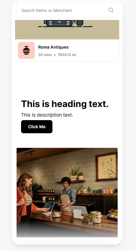
Mobile Content Alignment
Adjust text alignment for smaller screens
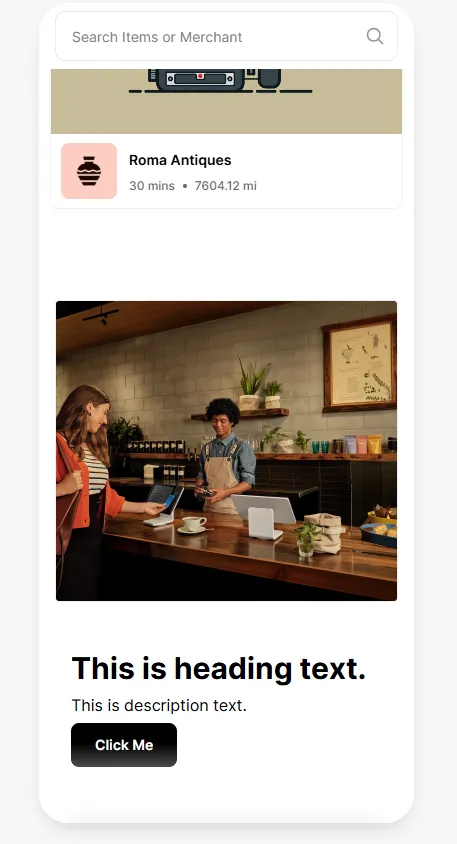
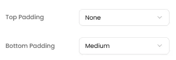
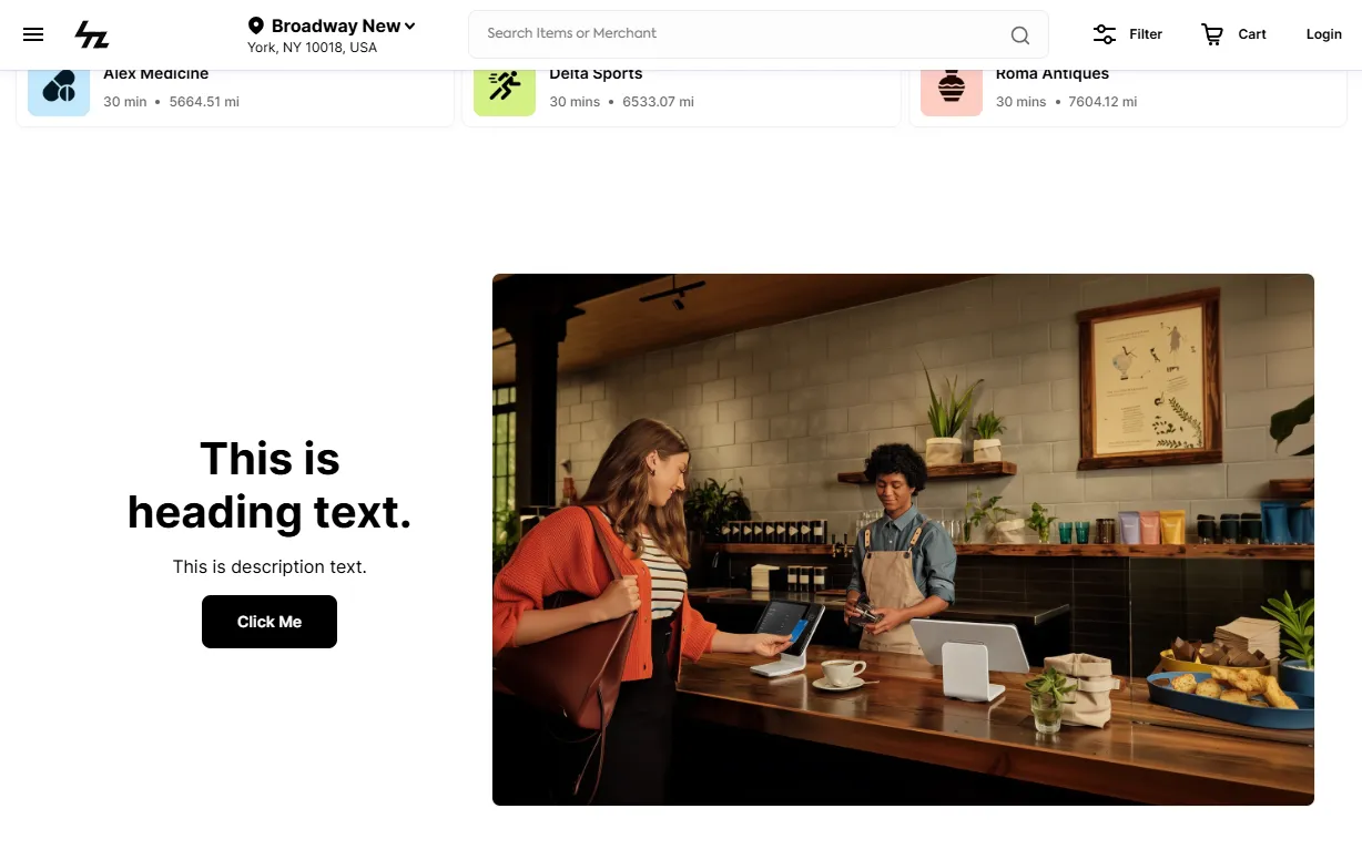
Padding (Top & Bottom)
Add spacing around the section for better visual separation
Text Settings
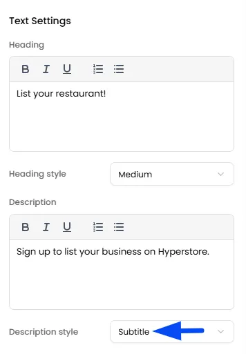
This section allows you to customize the text content of the section, including the heading, description, and their styles.
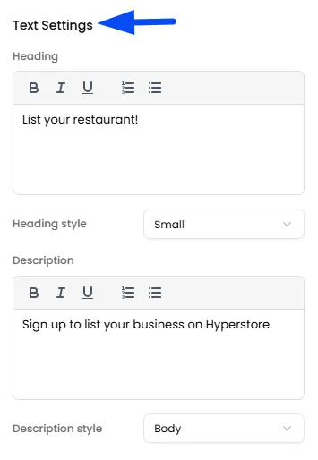
Heading
Provide the main title of the section for your visual
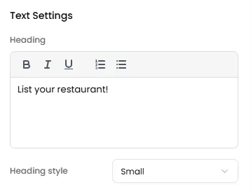
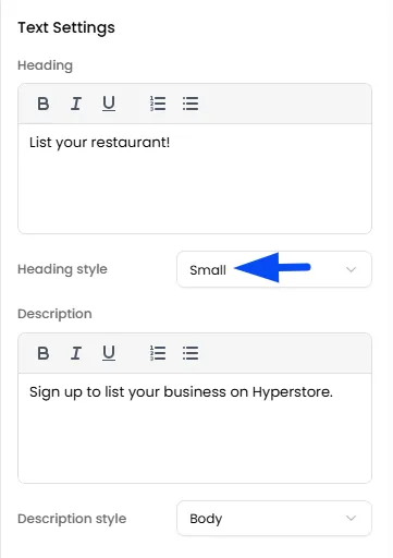
Heading Style
Control the size of the Heading (Small, Medium, Large)
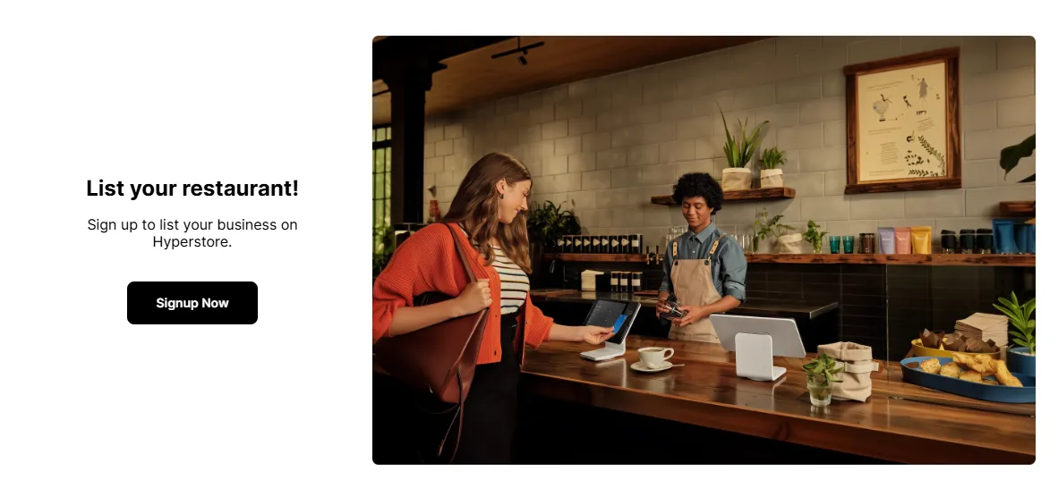
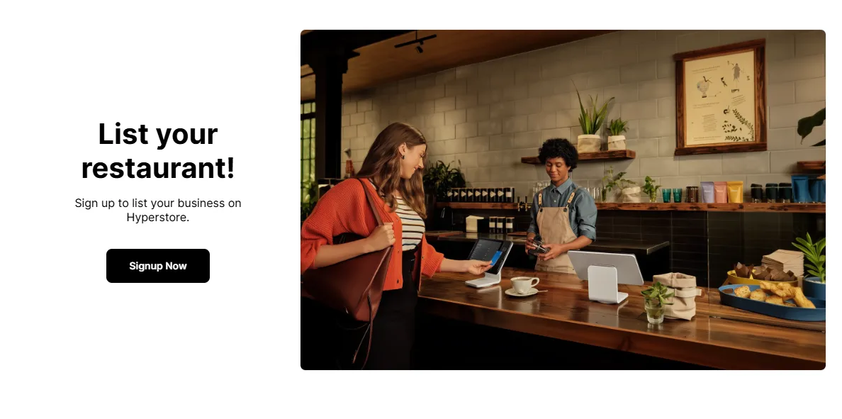
Description
Add supporting text to give more context to your visual. This helps explain the purpose of the section and makes it clearer for users to understand what you are highlighting.
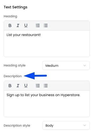
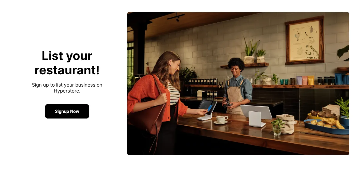
Description Style
Choose how the description text appears by selecting a style such as Body or Subtitle
Button Settings
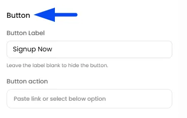
Through this section, you can define the Button Label and the action type linked to the button.
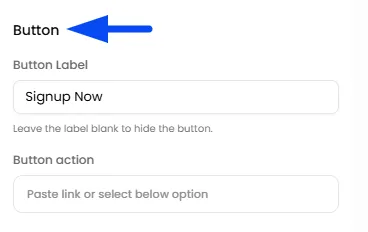
Button Label
Text shown on the button (e.g., Signup Now, Explore)
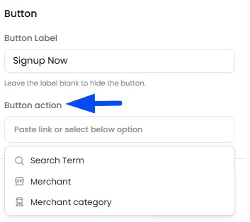
Button Action
Add a link or redirect users to a specific page using a search term, merchant, or merchant category.
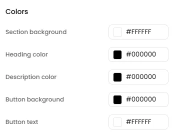
Color Customization
You can customize the section’s appearance by setting the background color, heading color, description color, and button colors to match your brand theme and maintain a consistent look.
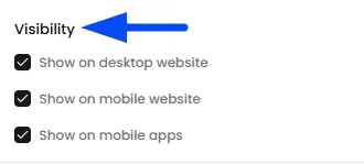
Visibility Settings
Control where this section is displayed by choosing whether it appears on desktop, mobile web, or mobile apps, allowing you to tailor the experience across different platforms.
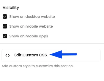
Custom CSS (Advanced)
You can add custom styling for more control over the design if required.
Upload Assets
The Upload Assets section allows you to upload images and generate links for them. These links can be used when adding custom sections to your pages or app screens, ensuring seamless integration of visual elements.
How to Access the Assets Panel
In the theme page, on the left panel, click on the square icon to access the "Upload Assets" panel.
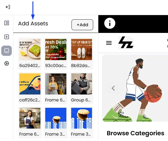
Add Assets
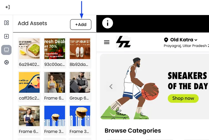
- In the Assets panel, click the Add button.
- This will open your computer's file explorer. Select the image you want to use and upload it.
- The image will now appear as a thumbnail in your Assets library.
How to Use Assets
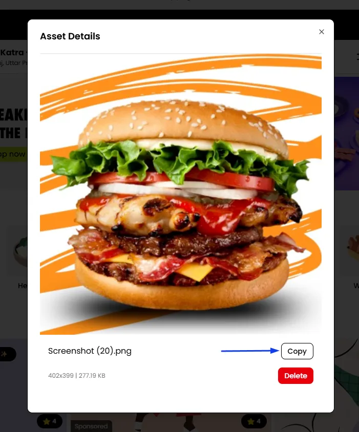
- Locate the uploaded asset and click on the thumbnail of the image you just uploaded from the list
- Copy the link of the image and close the pop-up.
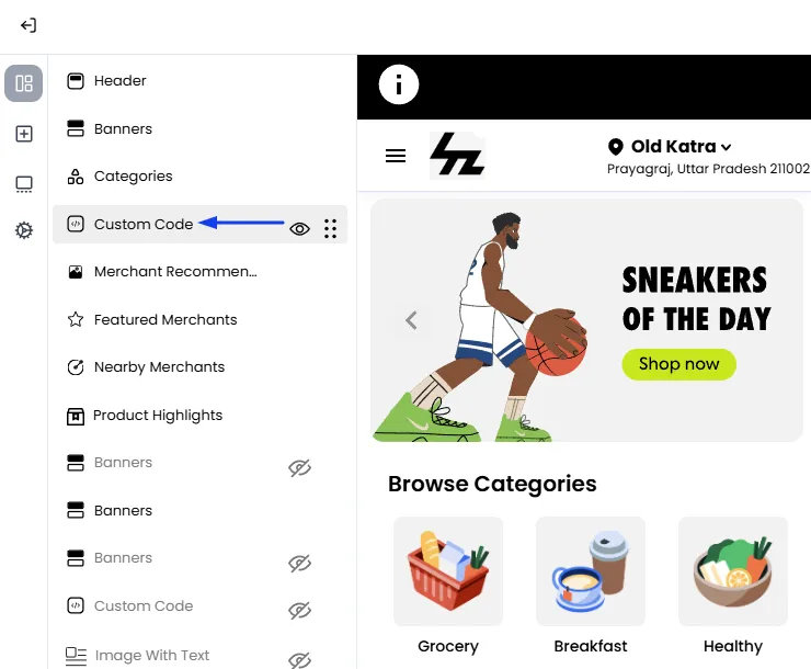
- Now select your Custom Code Element
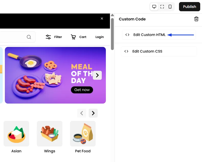
- From the right panel, Select Custom HTML
- Now you can utilize the image link in the code editor to write your HTML code & the section will be added.
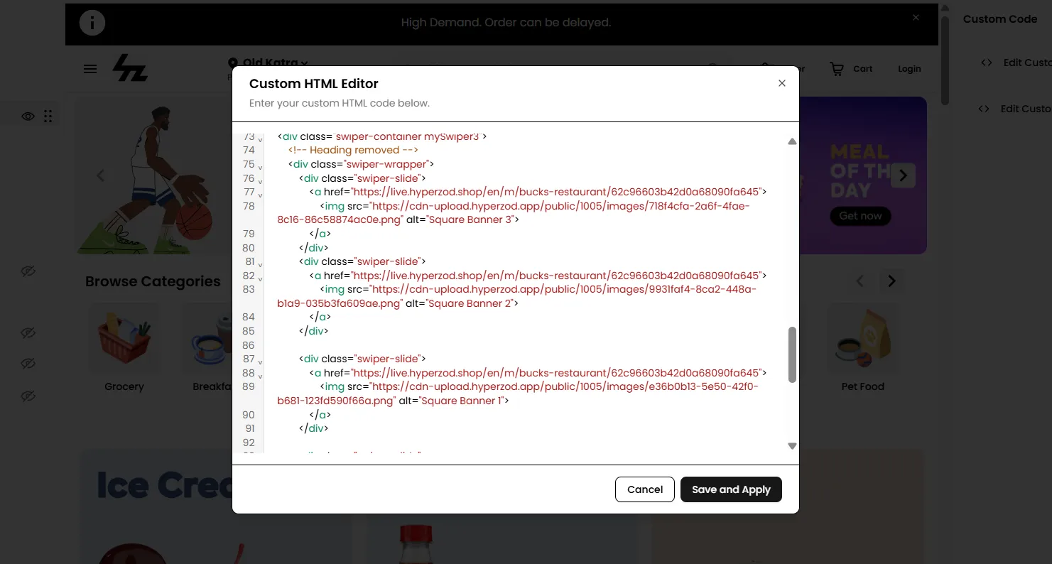
- Refine your image using the CSS editor for customizations or styling purposes.
- Verify that the added section reflects correctly in the page builder content. Finally, click the "Publish" button to apply the modifications.
Frequently Asked Questions (FAQs)